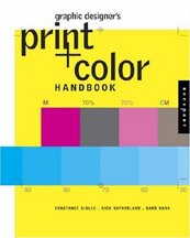
 I am addicted to bookstores. In Portland, or while traveling in any other city, I can seldom pass by a book retailer without stopping in to browse. I usually head right for the graphic design section. Quite often, while flipping through the volumes on the shelves, I will come across books containing examples of my work that I didn't know were going to appear in another book. Last week, in Seattle, I found a new Rockport Publishers offering - Graphic Designer's Print + Color Handbook : All You Need to Know about Color and Print from Concept to Final Output by Constance Sidles, Rick Sutherland and Barb Karg - on the shelf at Borders. This book covers everything from choosing color combinations to choosing the best paper and printing methods for a design job. It looks like a great resource for any graphics professional.
In going through the book I found several examples of my own work. It was a surprise to see them in this particular volume, but each had been included in a previous Rockport book on digital printing.
My design for a ticket price seating chart for the the old Kingdome in Seattle is included in the book. Years ago I designed the stationery package and all marketing/advertising materials for the Seattle Seahawks. The seating chart is used by book's authors to show a somewhat complicated piece that was produced using PDF files for proofing/editing by the client in Seattle and then sent in the same format to a print house in Portland.
I also designed all marketing materials for Action Sports Media, another company formed by Seahawks owner Paul Allen. One of the projects was a sales kit that could be customized for potential clients who were interested in ASM's professional and college sports arena digital signage. The piece represented in the new book is a map of all universities sports programs on the ASM client list at the time. It is included in the Print and Color Handbook to illustrate the possible use of short-run digital printing when more expensive traditional printing is not necessary.
The examples of projects I designed for the Oregon company Eid Access (now Eid Passport) are used in the book to show the flexibility of digital printing. The company - a specialist in security programs for military, government, and commercial facilities - used the items I designed as digitally produced brochure panels, handouts and tradeshow exhibit pieces that were 15" high.
It's always great to see my work represented in graphic design books that literally extend my marketing and promotion efforts worldwide. At this point nearly 80 books feature examples of my design efforts - especially my logo design work.
* If I don't "toot!" my own horn, no one else will
© 2015 Jeff Fisher LogoMotives


