Tipping the scales toward successful identity design

Having created identities for several law firms over the years, I was recently asked to write a piece on identity design for the Spring 2006 issue of Legal Manage- ment News: The Journal of the Association of Legal Administrators - Oregon Chapter. The text of that article follows:

When initiating the task of establishing a new corporate identity, most businesses find themselves wandering (or stumbling) into foreign territory. The following tips will assist those taking on such a project, making the design process a bit easier when dealing with “creative types” in solving a firm’s identity crisis.

Do not try this at home

Having a computer, and design software programs, does not make an individual an identity designer. Hire a professional to create your business logo – a basic element of your “brand.” Not all graphic designers, or design studios, specialize in identity design. Do your research in selecting the designer, or firm, to best fulfill the specific requirements of your corporate identity project. Seek referrals from businesses previously working with identity firms, flip through logo and identity design books at a local bookstore for design styles you like, or review portfolios of designers – in person or online – until you find the design professional best fitting your needs. Select someone with whom you will “play” well. Larger corporate identity projects and continuing branding efforts may evolve into a form of marriage between a business and a creative company.

The K.I.S.S. Principle

Nearly 30 years ago an instructor introduced me to the K.I.S.S. Principle of design; which translates to: Keep It Simple, Stupid. It does convey a very important design consideration. Simple logos are often the most easily recognized and memorable. Remember, the basis of the international branding for the world’s largest shoe manufacturer is a very simple graphic swoosh. The identity process for the Portland law firm Samuels Yoelin Kantor Seymour & Spinrad went through numerous sometimes complicated iterations before coming back to an early, very simple, concept of two thick law books creating the “S” letterform – representing the name Samuels, designated as the one constant in any future name changes. The icon has served the company well for the past decade.

Seeing your business image in black and white

When asked for the most important considerations in designing a logo, the K.I.S.S. Principle (above) is number one, followed closely by “make sure your logo works well in black and white.” Even in this time of technical and cyber marvels it is important for a business identity to translate clearly and professionally in black and white for the copying, faxing and scanning of required documents. In addition, a logo should initially be created in a vector-based illustration program (such as Adobe Illustrator or Macromedia Freehand) allowing for digital flexibility and easy usage in all applications your business may require, from a stationery package to signage. Those basic files will allow a designer to create and provide all the digital resources required to implement the identity into your internal systems. The frequently misused “bells and whistles” of some computer programs, put into action for 3-D effects, beveled edges, skewed type, gradients and other often-unnecessary graphic treatments, may create distractions from the readability and success of a corporate identity.

A graphic and financial investment in your corporate future

The creation of your logo, one of the most important and visible elements of your corporate image, should be regarded as an investment in the future of your firm’s marketing, promotion, advertising and community presence. That investment will include the actual costs of incorporating the new identity into your stationery, signage, web site, marketing efforts and much more. Designers do occasionally create over-the-top identities that may evolve into unnecessarily costly production and printing expenditures. Determine if your identity will really require a spendy four-color printing process. Evaluate whether embossing and foil-stamping are necessary on stationery used daily – especially when that expense may literally be flattened and melted by an overheated laser printer. Trendiness in a corporate identity may be a costly mistake as well. A logo should have some longevity and connect with a firm’s clientele and history in a positive manner. Shapes, colors and type treatments need to be evaluated for appropriateness. For example, the swooshes and arcs so prevalent in the dot com explosion of the last decade, now convey the negative connotation of the business doom of that time. In judging recent international design awards I have reviewed countless business identities using various shades of green and orange (individually and together); colors that will soon seem very dated. Unique, conservative and professional type treatments, beyond the limited, over-used font selections installed on a basic computer system, will set a business apart from the trendy appearances of other companies.

Putting your money where your logo is

Confirm that your company is ready to make that investment – emotionally and financially – in a new business identity and then revisit the supposedly final selection again. In 1998, the Portland firm now known as Smith Freed & Eberhard had expended a great deal of time, energy and resources in the selection of a new corporate identity. Many printed elements of the new image had already been produced and implemented. However, there was one major problem with the new logo. In the alphabet soup of the firm name at the time – Smith Freed Heald & Chock – the placement of the typographical elements within the logo did not correspond to the proper order of the partner’s initials in the business name. When it came time to cast the logo in bronze for the lobby signage the “powers that be” balked at spending thousands of dollars to create the over-sized plaque with the partner initials in the incorrect order. At that time I was brought in to completely redesign the firm’s identity – and have revised that design twice in the years since with changes in the corporate name.

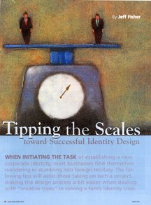
Thoughtful planning, extensive research, attention to details, and excellent communication – with internal decision-makers and your design professional – will tip the scales in the direction of a successful corporate identity design.

This entry was originally posted on bLog-oMotives on 05.05.06.

© 2008 Jeff Fisher LogoMotives

Identity Re-design:
Holocaust Remembrance Project

The Holocaust Remembrance Project is a program of the Holland+Knight Charitable Foundation, Inc - the charitable giving organization of the Holland+Knight law firm. The project is a national essay contest for high school students that is designed to encourage and promote the study of the Holocaust. Participation in the activity encourages students to think responsibly, be aware of world conditions that undermine human dignity, and make decisions that promote the respect and value inherent in every person. The project serves as a living memorial to the millions of innocent victims of the Holocaust.

The existing identity for the Holocaust Remembrance Project seemed depressing, dark and oppressive to me - especially when printed on a dark gray T-shirt given to student participants and essay judges. While those descriptive qualities may apply to that particular period of history, I felt the project identity should be celebrating those who have overcome the negatives of the Holocaust to inspire others to live exemplary lives.

The Holocaust impacted a wide variety of people, not just those of the Jewish faith. The triangle-shaped uniform badges assigned to those in the concentration camps were color-coded to identify the individuals. The color codes were:

• Red: Political prisoners - including Poles, Czechs and members of the Armed Forces

• Green: Those considered to be criminals

• Blue: Emigrants

• Yellow: Jews (two triangles were overlapped to form the Star of David)

• Purple: Jehovah’s Witnesses

• Pink: Gay males

• Black: Vagrants, gypsies, and “anti-social” women (lesbians, prostitutes, women using birth control)

In my initial mental design concept, I felt that those impacted by the Holocaust should take "ownership" of those negative identitifying triangle symbols. I inverted the geometric shapes to point to the sky and form colorful rays of a strong, positive sun image. The result is a graphic identity that has been given a sense of light, while making use of the representative colors and projecting an image of honor and respect in regards to the issue of the Holocaust.

The identity was recognized with a 2008 American Graphic Design Award.

(Note: My new book, Identity Crisis!: 50 Redesigns That Transformed Stale Identities Into Successful Brands, contains case studies from 35 designers and firms located around the world. Learn more about the book on the Identity Crisis! blog.)

© 2007 Jeff Fisher LogoMotives

Excavated Design Artifact #4

It's amazing what I find while cleaning out old files. I guess I should be pleased that I've seldom thrown anything away during my career. There, stuck in a totally unrelated file folder, was a piece of paper with couple of phone messages from sometime in 1986 when I was sharing office space with City Guide Magazine, the Seattle Men's Chorus, the Alice B. Theatre company and the Pride Foundation. The yellow paper has even more yellowed scotch tape on it and a thumb tack hole where I probably stuck it on a bulletin board at some point. The messages said "Jeff Hest called - will be at the Ritz @ 5 pm" and "Ken D. called." Jeff was one of my best buddies when I lived in Seattle, the Ritz Cafe (long since closed) was one of our favorite bars, and Ken D. (Decker - now long deceased) was a great friend and client.

The phone messages were not why I've saved the scrap of paper for about 20 years. Also on the paper were the doodles of what were to become a logo and T-shirt design.

The late 80's found the U.S. dealing with the ever-growing AIDS crisis. At the time I was doing design work for a number of AIDS and health organizations in both Seattle and Portland. Part of my work involved getting safe-sex messages across to the general public. I'd been kicking around the idea of a graphic proclaiming "A Rubber's Ducky" - or, in other words, "a condom is a good thing" - for some time. Obviously, that idea manifested itself in the sketches on a message pad.

The original concept was for the traditional rubber ducky we played with as a kid to have its head sticking out of a nautical life preserver. The text "Rubber Ducky" appears in the first very rough sketch. The beginnings of what were to be the duck image, with a hint of rope, appear in the second rough.

As the design was fine-tuned, the life preserver took on the more realistic look of those on a friend's boat. The duck somehow developed the reservoir tip of a condom on the top of its head and - in the stencil type often seen on sea-going vessels - the text became "A Rubber's Ducky." The result is still one of my personal favorites in the vast collection of identities I've designed. In part, I'm sure due to the cute and clever incorporation of the serious safe-sex message. A few T-shirts were produced for friends back then. Mine has long since worn out. Perhaps it's time to produce a new batch for the current generation that might benefit from the message.

The image has kind of taken on an international life of its own. It appears in the Japanese book New Logo & Trademark Design (republished in paperback as Logo and Trademark Collection), the first book in the LogoLounge series and in the recent Spanish volume Logos from North to South America. It also was recognized with LOGO 2001 honors and, as a result was published in the book The Big Book of Logos.

The process of going through 30 years of design files is tedious and somewhat exciting. I'm cataloging and archiving all examples of my work - and certainly not throwing anything away. I'll be sharing more past projects in the future.

(This entry originally appeared on bLog-oMotives on August 5, 2006.)

© 2007 Jeff Fisher LogoMotives

Excavated Design Artifact #3

It's amazing what I've saved over the years in regards to projects I've been contracted to design. The simple Post-It note scribble at the left is just one example of the many preliminary concepts I have come across recently in archiving past projects.

Since I was a kid I have spent a great deal of time in the small Central Oregon town of Sisters, Oregon. The favorite backpacking destination of my family was the nearby Three Sisters Wilderness area. In the 1970's my parents bought property in Sisters, eventually building a vacation home that has been their primary residence for the past 15 years. For many years the Sisters Rodeo, "The Biggest Little Show in the World," has been a family tradition - with an annual weekend party at my parents' home that has become somewhat legendary.

To celebrate the 60th anniversary of the Sisters Rodeo it was determined that it might be time for the organization to finally have an official logo. The Sisters Rodeo Association was already working with my sister's advertising agency, TriAd in nearby Bend, for their advertising, marketing and public relations needs. Sue's firm was asked to take on the identity project and she hired me to create the initial image for the rodeo. In one of our telephone discussions I jotted down a rough type treatment - for a logo that I hoped would convey a hint of the 1940's and be a lasting symbol for the Professional Rodeo Cowboys Association event.

From the beginning of the project I had no doubt the symbol representing this live-action piece of Western Americana would end up being red, white and blue in color. The flags, banners, music and patriotism associated with the rodeo immediately dictated that color palette. I also knew that I wanted a cowboy on a bucking bronco, or bull, as the primary element. Having seen many a cowboy hat fly through the air at previous rodeos, I felt graphically representing that would add a little implied movement - and my own little brand of humor - to the logo. The cowboy graphic fit well into the "O" of my original scribble, and the airborne cowboy hat became the dot of the "i" letterform in the word "Sisters," as the symbol almost designed itself.

The logo has served the event well the past six years - and received several honors. In 2000, the identity was included when the Sisters Rodeo was inducted into the Library of Congress “Local Legacies” archive. The following year the logo was honored with an Award of Merit in the Ad Federation of Central Oregon's annual Drake Awards, a Silver Award in the Summit Creative Awards, and received a LOGO 2001 honor (resulting in the design being published in the book The New Big Book of Logos). The design was also published in Logo Lounge : 2,000 International Identities by Leading Designers.

(This entry originally appeared on bLog-oMotives on December 30, 2005.)

© 2007 Jeff Fisher LogoMotives

Event Logos

(Clockwise from upper left)

Laugh Lover's Ball
Client: Laugh Lover's Ball
Location: Seattle, WA USA

The identity for an annual Seattle fund-raising event featuring nationally recognized comedians.

Learn more about this logo redesign project here.

Dinner at My House for Our House
Client: Our House of Portland
Location: Portland, OR USA

This pro bono design represents an annual fund-raising event for the AIDS/HIV residential care facility Our House of Portland. It appear in The New Big Book of Logos.

Lavender Law IV
Client: National Gay and Lesbian Law Association
Location: Washington, DC USA

Lavender Law is the conference of the National Gay and Lesbian Law Association. When the event was held in Portland I designed the logo and marketing materials.

Lucille Hart Dinner
Client: Right to Privacy PAC
Location: Portland, OR USA

The identity represented the annual fund-raising dinner of the Right to Privacy Political Action Group.

All logo designs © 2015 Jeff Fisher LogoMotives. All rights reserved.

Excavated Design Artifact #2

As I explained in an earlier post, I've been going through boxes of nearly 30 years worth of design work as I attempt to get my studio a bit more organized. In the process I've been coming across initial sketches that became final logos for many clients. Some of the doodles have been on Post-It notes, the backs of envelopes and little scraps of paper.

After initially meeting Don Horn - the founder of Portland's triangle productions! theatre company - at his very first opening night, I began designing logos, signage, posters, T-shirts, theatre programs and other items for his shows and theatre spaces. It was the start of what has become a 15+ year business relationship and friendship. Horn has always been one of my favorite clients; giving me complete creative freedom on the design projects. I have also been recognized with more design awards for the theatre projects than those for any other single client.

Over the years, I've had the opportunity to create logos for plays with great names. Soon after Horn told me he would be producing the show When Pigs Fly I scribbled a rough concept on a little yellow Post-It note. It immediately seemed natural that the curly tail of the pig would become the "S" in the show's name. The final design evolved directly from that sketch and made use of the colors selected for all promotional pieces for that year's schedule of productions. An added bonus was that the When Pigs Fly identity was recognized with an American Graphic Design Award from Graphic Design: usa and a Bronze Award from the Summit Creative Awards.

(This entry originally appeared on bLog-oMotives on December 13, 2005.)

© 2007 Jeff Fisher LogoMotives

Excavated Design Artifact #1

I'm not sure when I first started getting paid for actual design work. I remember earning income from some of my illustration work while still in junior high about 1970. I did have a paid, sit-at-a-desk, design job while in college as the designer for the advertising department of the University of Oregon college newspaper, the Oregon Daily Emerald. Using that 1978 job as a marker I've been working as a professional designer for nearly 30 years - and I have nearly every design project I've ever done saved in my personal archives.

I've initiated the process of trying to organize those files, boxes, drawers and piles of past design jobs. I'm learning just how little I've thrown away over the years. In the process of excavating my career I've found many little rough sketches for logo projects on napkins, envelopes, meeting notes, Post-It notes and other scraps of paper. Many of those initial, quickly-drawn creative thoughts evolved into final identity designs for my clients.

One such project was the personal logo design for the guy who began cutting my hair over a decade ago. In 1995 Jeff Maul asked if I could come up with an identity for his work as a Portland hair stylist. One day I scribbled a rough concept for his logo on a torn scrap of paper. When I finalized the design, it was the one and only design concept I presented to a very pleased client. I did follow the K.I.S.S. (Keep It Simple, Stupid) principle and eliminated the fingers elements I had included in the rough sketch. I was paid for the completed project in future haircuts.

The logo bought a great deal of attention to my design work, and became an important element in the focus of my design work changing to the creation of logos. One of the most recognized identities I've produced in my career, the logo appears in the books International Logos & Trademarks 3, Letterhead and Logo Design 5, New Logo & Trademark Design (Japan), Bullet-Proof Logos: Creating Great Designs Which Avoid Legal Problems, The Best in World Trademarks 1- Corporate Identity (Korea), LogoLounge, Volume 1, The Best of Letterhead and Logo Design, Logo Design for Small Business 2, and New Logo: One (Singapore). The logo also appeared in the 1996 PRINT Regional Design Annual. One simple, one-color logo has been marketing my design efforts, and appearing in new books, for ten years now.

In coming "excavated artifact" entries I'll share other rough design concepts (along with the final design) I find while digging in my home-based studio

(This entry originally appeared on bLog-oMotives on November 25, 2005.)

© 2007 Jeff Fisher LogoMotives

Identity Re-design: Balloons on Broadway

The original logo for the balloon delivery service (below left), and gift/card retailer, Balloons on Broadway had served the company well, but did not convey much about the business itself. As more customers began to refer to the company by its initials, B.O.B., the owners decided to have a new identity created.

The new logo (above middle), with the inclusion of a balloon graphic, projected much more of the fun and energy of the business - and the individuals running the company. The colors for the firm remained black and white.

With a later move to a new location, and introducing the business to the Internet, I was contracted to create yet another update of the company image was in order (above right). An unrelated local business had started using a “BOB” advertising campaign so Balloons on Broadway opted to move away from that reference while maintaining much of the previous logo’s appearance. Color was added, which could also translate well to a web presence and neon signage. The colors could be manipulated to signify various holiday promotions. Animation was also introduced to the image. The logo is still often presented in black and white, tying into the previous branding of the business.

The logo currently represents the balloon delivery and event planning business only. The retail operation has been renamed to better represent the products sold.

The Balloons on Broadway logo received a Bronze in the Summit Creative Awards. The identity is featured in The Big Book of Logos 3, New Logo World (Japan), Logo Design for Small Business 2, Logos from North to South America (Spain) and Logos Redesigned.

(Note: My new book, Identity Crisis!: 50 Redesigns That Transformed Stale Identities Into Successful Brands, contains case studies from 35 designers and firms located around the world. Learn more about the book on the Identity Crisis! blog.)

© 2007 Jeff Fisher LogoMotives

Identity Re-design: Valley Catholic High School

The Portland firm Whitman Advertising & Public Relations contracted me to execute a local identity re-design back in the late 1980's. The client was St. Mary of the Valley High School, an education institution established in 1902, located in Beaverton, Oregon. The institution's name was a bit for people to stumble through - and the logo being used (above) seemed to present similar difficulties.

Within the original identity there had been an attempt to maintain a much-used monogram made up of the letterforms "St," "M" and "V," resulting in a somewhat awkward configuration of the school name when spelled out in its entirety. The lowercase "t" cut into the dome element sitting on top of the "S" and "M." The odd, horizontal configuration of the logo created layout and design difficulties each time it was used. With the original logo art long since misplaced, both the dome illustration and the dated University Roman type treatment were starting to lose fine line integrity from being repeatedly reproduced.

I was asked to create the identity for the updated school name of Valley Catholic High School. There had been a previous attempt (above left) to produce a logo with the new name, but it simply wasn't working well for the client - for many of the same reasons mentioned in regards to the original identity.

I just recently came across the original sketches and drawings (above) of my initial rough concepts for the logo. With the dome of the main building being a familiar community landmark there was no question it would the primary element in the design. In the pre-computer time, the ideas were sketched out in fine point felt tip pen, made use of rub-down type, incorporated some individual letters cut from photocopies, and had a good amount of Liquid Paper correction fluid on the pages.

Following acceptance of the "dome within a dome" rough design, I produced a stronger, bolder graphic - using a rapidiograph pen, circle templates and a ruler - eliminating many of the earlier reproduction issues. The font ITC Caslon 224 Medium was what I specified as the predominant type within the design; with Franklin Gothic Condensed used for secondary text elements. Of course, this was back in the day when typesetting was ordered through a type house.

The Valley Catholic High School identity I created was used for several years. I'm not sure when the current image, with a much more literal treatment of the dome graphic, was adopted - but the school name was changed again in 1991, to Valley Catholic School, when the high school and middle school programs were merged.

(Note: My new book, Identity Crisis!: 50 Redesigns That Transformed Stale Identities Into Successful Brands, contains case studies from 35 designers and firms located around the world. Learn more about the book on the Identity Crisis! blog.)

© 2007 Jeff Fisher LogoMotives

Business Logos

(Clockwise from upper left)

Virtual Office
Client: VIrtual Office
Location: Yachats, OR USA

The logo for a virtual office assistant, with the lizard imagery being a personal request of the client. The design is featured in New Logo & Trademark Design (Japan), The New Big Book of Logos, and New Logo: One (Singapore).

Sing Out Productions
Client: Kay Johnson's Sing Out Productions
Location: Littleton, CO USA

Kay Johnson, motivational speaker and singer, is the principal of Sing Out Productions. She delivers dynamic, inspiring and humorous keynotes, presentations and workshops at corporate events. The logo appears in The New Big Book of Logos, Blue is Hot,Red is Cool, The Big Book of Design for Letterheads and Websites and Logos from North to South America(Spain).

Coyner's Auto Body
Client: Coyner's Auto Body
Location: Portland, OR USA

The business never had a previous logo and the owner wanted a design that reflected its 1970s founding. The image appears in the book Logos from North to South America (Spain).

AMP
Client: AMP/Anne-Marie Petrie
Location: Sacramento, CA USA

The AMP identity represents high-energy public relations and marketing specialist Anne-Marie Petrie. The image appears in New Logo & Trademark Design (Japan), The New Big Book of Logos, Graphically Speaking, and The Big Book of Design for Letterheads and Websites.

All logo designs © 2015 Jeff Fisher LogoMotives. All rights reserved.

Identity Re-design: American Telecom

When I was approached by this communications company, back in 1997, the identity in use had many negative attributes. The major issue was that the odd shape didn't work well in many applications. The flag, which was not well-executed, seemed to simply be slapped up next to the name and did not reproduce clearly in small sizes. The letterforms appeared to be inconsistent in shape and size, and the kerning was out of whack. The star above the "I" letterform was too close to the letter and the two became a blob in printing usage, especially in one-color newspaper ads. The identity was just not a cohesive unit.

The major goal of the new logo was to create a tight, clean symbol that would work well in any application. The client was adamant about maintain- ing a flag element, stars, the patriotic color scheme and a reference to their business classification. I was able to incorporate all the client's desires into a symbol that did not take the design elements as literally. The flag became more of an abstract image that also subliminally conveyed communication through implied sound waves imagery.

The logo received an American Corporate Identity award and also appears in the books New Logo: Two (Singapore) and The New Big Book of Logos.

(Note: My new book, Identity Crisis!: 50 Redesigns That Transformed Stale Identities Into Successful Brands, contains case studies from 35 designers and firms located around the world. Learn more about the book on the Identity Crisis! blog.)

© 2007 Jeff Fisher LogoMotives

Toot! Toot!*:
Jeff Fisher LogoMotives showcased in
Spanish book Eating & Designing

The design work of Jeff Fisher, the Engineer of Creative Identity for the Portland firm Jeff Fisher Logo- Motives, is included in the newly released book Eating & Designing from Spanish publisher Index Book. Logos designed for the Seattle Hamburger Mary's and Celilo - the former restaurant in Portland's Governor Hotel - appear in the book by designer Marta Aymerich. The volume is a collection of restaurant identities from around the world, and the use of those images in menus, signage, advertising, websites and interiors.

A hand holding a raised hamburger takes the form of the Space Needle in the logo for Hamburger Mary's. The design was previously featured in the Japanese books New Logo and Trademark Design and Logo and Trademark Collection.

The Governor Hotel interiors; and marketing and promotion efforts created by designer Jeff Fisher; made use of imagery associated with the Pacific Northwest exploration of the Lewis & Clark expedition and the 1905 Portland exposition celebrating the centennial of the trek. Letterforms from the handwritten journals of Meriwether Lewis were used to create the identity for the Celilo restaurant when the eatery and the hotel originally opened.

Jeff Fisher has received nearly 575 regional, national and international graphic design awards for his logo and corporate identity efforts. His work is featured in nearly 100 books on the design of logos, the business of graphic design, and small business marketing.

Fisher is a member of the HOW Magazine Editorial Advisory Board, the HOW Design Conference Advisory Council and the UCDA Designer Magazine Editorial Advisory Board. His new book, Identity Crisis!: 50 Redesigns That Transformed Stale Identities into Successful Brands, was recently released by HOW Books. His first volume, The Savvy Designer’s Guide to Success, appeared on bookstore shelves in late 2004.

(* If I don’t "toot!" my own horn, no one else will.)

© 2007 Jeff Fisher LogoMotives

Identity Re-design:
Benicia Historical Museum

The Benicia Historical Museum in Benicia, CA is located in the historic Benicia Arsenal structures, where camels were housed after a failed U.S. Military experiment to use them as pack animals in 1850's and 1860's. Initially, the museum seemed to have a split personality with two graphic elements being used for the facility's identity. The simplistic circular logo incorporated a camel and arches representing the buildings. An almost cartoon-ish camel image was used for online identification of the museum. The images were used in one-color; usually black or dark brown.

The museum requested an identity that graphically conveyed a historical perspective for marketing and promotion purposes. A bit more focus on the locally recognized historic structures was desired, while maintaining some reference to the camels of post Civil War times.

The oval shape, with banners, presented a more "antique" look for the identity. The font trio of Horndon, PanAm and Copperplate added to the image. The camel image used was borrowed from an antique etching of the historic facility. Stars incorporated into the design hint at the military history of the site. The colors used reflect the sandstone buildings and the red in the original flag used when Benicia was California's state capitol.

The new identity is serving the museum very well in drawing much more attention to its presence in the local community and surrounding area. It's also bringing recognition to the museum on a national and international level. Last year the logo received an American Corporate Identity 22 award and, as a result, is featured in the book American Corporate Identity 2007. Recently it was announced that the image also received a LOGO 2007 honor and will be in the upcoming book The Big Book of Logos 5.

(Note: My new book, Identity Crisis!: 50 Redesigns That Transformed Stale Identities Into Successful Brands, contains case studies from 35 designers and firms located around the world. Learn more about the book on the Identity Crisis! blog.)

© 2007 Jeff Fisher LogoMotives

Identity Re-design: Tel-Med

Over 25 years ago I began doing a lot of independent design work for the Multnomah County Medical Society. My client contact was then successful in tempting me with an offer to come in-house to create a design department for the organization. (She was one of the most incredible supervisors I've ever had.) My primary job was designing the Portland Physician magazine, the annual directory of members, and the tabloid size Portland Physician Scribe newspaper. Once in a while I got to be a bit more creative and design logos, publication promotional items, invitation, or projects for member doctors.

Tel-Med was a free medical help-line service of the organization, offering pre-recorded messages in answer to a wide variety of basic medical questions. The old logo consisted of an illustration of an antique-style phone next to the name. The phone image did not successfully convey the modern capabilities of the system and a new image was requested.

The new graphic identity for Tel-Med incorporated a stylized human form, as a medical professional, and the push buttons of modern phone equipment. The symbol was often used without text and still successfully conveyed the purpose of the service.

This re-design appears in the book Logos Redesigned: How 200 Companies Successfully Changed Their Image by David E. Carter.

(Note: My new book, Identity Crisis!: 50 Redesigns That Transformed Stale Identities Into Successful Brands, contains case studies from 35 designers and firms located around the world. Learn more about the book on the Identity Crisis! blog.)

© 2007 Jeff Fisher LogoMotives

Toot! Toot!*: Create Magazine features
Jeff Fisher LogoMotives identity designs

The recently released November-December 2007 issue of the industry publication Create Magazine features two logo designs from Jeff Fisher, the Engineer of Creative Identity for the Portland-based firm Jeff Fisher LogoMotives. The identities for the Irish web development firm DesignEire and a self-promotion piece honoring designer Milton Glaser are highlighted in a feature on the magazine's online Create Network logo Image Battle competition.

Membership in the Create Network, on the publication's website, is free. Members may post blogs, share creative news, participate in an online forum, present a limited portfolio of work examples, and participate in activities such as the Image Battle. Paid memberships provide visitors additional resources and information.

The Image Battle creates a competition between two pieces of work in a variety of classifications. Members may then vote for favorites in each category. The Create Magazine Network section article shows the seven highest ranked logo designs. Two of those identities are by designer Jeff Fisher.

The DesignEire logo was produced for a web development company located in Dublin, Ireland. The design won a Summit Creative Award (Silver) and appears in the books The Big Book of Logos 3, New Logo World (Japan), Graphically Speaking, Global Corporate Identity, and Logo Design for Small Business 2. It was also once critiqued by the UK newspaper The Sunday Times.

Create Magazine erroneously notes that the Milton Glaser image was designed for the design icon. In fact, it was created for, and will appear in, the upcoming book A Tribute to Celebrities from author Pedro Guitton and Spanish publisher Index Book.

Jeff Fisher has received nearly 575 regional, national and international graphic design awards for his logo and corporate identity efforts. His work is featured in nearly 100 books on the design of logos, the business of graphic design, and small business marketing.

Fisher is a member of the HOW Design Conference Advisory Council and the UCDA Designer Magazine Editorial Advisory Board. This past month, his book, Identity Crisis!: 50 Redesigns That Transformed Stale Identities Into Successful Brands, was released by HOW Books, an imprint of F+W Publications. His first book, The Savvy Designer’s Guide to Success, was released in late 2004.

(* If I don’t "toot!" my own horn, no one else will.)

© 2007 Jeff Fisher LogoMotives

Identity Re-design: Joy Creek Nursery

With gardening season upon us (at least in the Pacific Northwest with improvements in the weather), I look forward to pushing myself away from the computer much more for some playing in the dirt as "garden therapy." My partner Ed, family and friends still marvel, and snicker, at the fact I've become a such a gardener since moving to our North Portland house. Part of my enthusiasm is due to the efforts of Joy Creek Nursery in preparing an incredible palette for the digging, planting, weeding and enjoyment of my garden. As Joy Creek Nursery celebrates a 15th year in business I'm taking a look back at their logo redesign project.

The original logo for Joy Creek Nursery was created by a local print shop out of an immediate need when the business started. A “brand” for the company was then established by using the existing identity on signage, business cards, print ads, catalogues and other items. For designing other marketing and promotion items, and use by the owners, a digital logo was provided in the resolution shown.

In 1998, my thoughts about the existing logo, and its reproduction issues, were conveyed to the owners, who are friends of mine. The inconsistent weight of the letters in the text, the haphazard computer manipulation of the letterforms, the poor quality of the only existing digital imagery, and the two typefaces used in the design blended to convey a graphically unprofessional image for the high-end specialty nursery.

The client expressed concern about introducing a “new” logo after having been in business for some time. They were informed that a “revised” design could maintain a sense of the existing brand, while projecting more professionalism.

The new logo, using a more elegant type, still says “Joy Creek Nursery” to the firm’s clients and vendors. The flowing form between the words hints at the actual creek flowing through the nursery property when presented in blue and conveys an image of the rolling hills of the area when the logo is printed produced as a one-color design in green.

The Joy Creek identity has received its fair share of recognition. The design received a LOGO 2001 award and, as a result appears in the book The New Big Book of Logos. It also is featured in the volumes Logo Design for Small Business 2, Logos Redesigned: How 200 Companies Successfully Changed Their Image and New Logo World (Japan).

(Note: My new book, Identity Crisis!: 50 Redesigns That Transformed Stale Identities Into Successful Brands, contains case studies from 35 designers and firms located around the world. Learn more about the book on the Identity Crisis! blog.)

© 2007 Jeff Fisher LogoMotives

Identity Re-design:
North Portland Business Association

Re-designing a business or organization identity can be a challenging process. In addition to attempting to produce a strong new graphic symbol for the entity, it is necessary to take the possible emotional attachment to a prior image into consideration. Adding the design-by-committee aspect of working with a nonprofit organization, or large corporation, to the mix can make such a job much more complicated.

My local neighborhood business association was a dream client when it came to considering a new logo. There was little vested interest in the previous identity and the decision makers of the group were quick, clear and concise in selecting a design to represent their efforts.

The original identity for the North Portland Business Association (above) was a simple and amateur graphic representation of the acronym NPBA. It was usually only evident in the flag of the organization’s monthly newsletter.

The new logo, which reproduces well in one or two colors, projects images symbolic of the North Portland business neighborhood – simplified illustrations of the St. Johns Bridge, the Fremont Bridge and the blue herons that are native to the area. By not conveying images specific to certain industries or businesses of the region, the logo successfully represents all business entities in North Portland. The identity is used on decals for member business, signage for events, the newsletter and membership marketing materials and gives the organization a polished, professional image in the community.

The new North Portland Business Association identity appeared in the recently released Spanish book Logos; From North to South America.

You will find additional examples of identity, web and print redesigns on the Creative Latitude site, in a section called GRAPHIC makeovers. Designer Alina Hagen contributes her observations to the submitted design projects. Quite a few of my own redesign efforts are posted at "GRAPHIC makeovers." Creative Latitude is always looking for other before and after design examples to display on the web site - do consider submitting some of your own efforts.

(Note: My new book, Identity Crisis!: 50 Redesigns That Transformed Stale Identities Into Successful Brands, contains case studies from 35 designers and firms located around the world. Learn more about the book on the Identity Crisis! blog.)

© 2007 Jeff Fisher LogoMotives

"Identity Crisis is a rare book" - Chuck Green

One of the blogs I check out on a regular basis is PagePlane, an online presence of design industry expert and author Chuck Green. His site Ideabook.com, the tutorials he offers, and his Jumpola design links are incredible resources for anyone in the profession.

On PagePlane Green has posted a review of Identity Crisis! under the headline Identity Crisis is a rare book. In part the review reads:

If you are a graphic designer who has real-world clients—I suggest you add this book to your toolbox. If you are a business owner or marketer who wants to see how others make over and leverage their identity—Jeff Fisher’s Identity Crisis is a good place to start.

The entire review is available on PagePlane.

© 2007 Jeff Fisher LogoMotives

Toot! Toot!:
HOW "Designer's Good Business Guide"
features Jeff Fisher start-up advice

Jeff Fisher, the Engineer of Creative Identity for the Portland-based design firm Jeff Fisher LogoMotives, is featured in an article in the "Designer's Good Business Guide" issue of HOW Magazine. The piece, "Start Smart," written by Esther D'Amico, appears in the December 2007 issue of the publication.

Fisher is one of nine industry experts giving advice to designers who may be considering quitting their day job and striking out on their own. Others cited in the article include Justin Ahrens of Rule 29, David C. Baker from ReCourses, Nicole Block of NicEvents, and Sayles Graphic Design's Sheree Clark. Cameron Foote from Creative Business, Keith Pizer of One Trick Pony, Christine Sullivan from The Creative Economy Association of the North Shore of Massachusetts, and Tortorella Design's Neil Tortorella also provide input.

HOW Magazine provides graphic-design professionals with essential business information, covers new technology and processes, profiles renowned and up-and-coming designers, details noteworthy projects, and provides creative inspiration. Fisher has been a member of the publication's Editorial Advisory Board since 2004.

Jeff Fisher has received nearly 575 regional, national and international graphic design awards for his logo and corporate identity efforts. His work is featured in nearly 100 books on the design of logos, the business of graphic design, and small business marketing.

Fisher is a member of the HOW Design Conference Advisory Council and the UCDA Designer Magazine Editorial Advisory Board. This past month, his book, Identity Crisis!: 50 Redesigns That Transformed Stale Identities Into Successful Brands, was released by HOW Books, an imprint of F+W Publications. His first book, The Savvy Designer’s Guide to Success, was released in late 2004.

(* If I don’t "toot!" my own horn, no one else will.)

© 2007 Jeff Fisher LogoMotives

Toot! Toot!*: Jeff Fisher book signing
at St. Johns Booksellers - November 8th

31 October 2007
For immediate release

St. Johns Booksellers, the neighborhood bookstore of North Portland graphic designer and author Jeff Fisher, will be the location of a presentation and book signing for his new book, Identity Crisis!: 50 Redesigns That Transformed Stale Identities Into Successful Brands, on Thursday, November 8th at 7:30 p.m. Bookstore owners Liz Dorman and Nena Rawdah will host the event in their store, located at 8622 N. Lombard in the St. Johns neighborhood - about 15 minutes north of downtown Portland.

Identity Crisis!, a HOW Books/F+W Publications release, takes a fresh look at 50 before and after case studies, from designers and firms from around the world, by exploring the process of redesigning existing identities to help businesses refine their image, communicate with customers, and find success. Designers seeking inspiration - and any business considering a graphic makeover - will be presented an inside look at the challenges of redesigning identities and visual examples of creative and strategic thinking in achieving the desired results.

The work of Portland design firms Fullblast, Inc., Sockeye Creative and Jeff Fisher LogoMotives, and Salem company Glitschka Studios, is featured in the book. Jack Anderson, of the Seattle firm Hornall Anderson Design Works wrote the foreward for Identity Crisis!

Title: Identity Crisis! 50 Redesigns That Transformed Stale Identities Into Successful Brands
Hardbound: 216 pages
Publisher: HOW Books, an imprint of F+W Publications
Release: September 2007
ISBN: 1581809395
Price: $35.00

St. Johns Booksellers is a full-service, independent neighborhood bookstore offering new and used books. Anyone having questions about the Identity Crisis! book signing event is encouraged to contact the store at 503.283.0032, Tuesdays through Sunday.

For more information, visit the Identity Crisis! blog. A downloadable PDF file of some teaser spreads is also available on the blog of publisher HOW Books.

Jeff Fisher, the Engineer of Creative Identity for the Portland firm Jeff Fisher LogoMotives, has received nearly 575 regional, national and international graphic design awards for his logo and corporate identity efforts. His work is featured in nearly 100 books on the design of logos, the business of graphic design, design education, and small business marketing. In addition, Fisher also writes for CreativeLatitude.com, HOW Magazine and other design resources; and speaks about the design profession to high school classes, college students, and at international design industry conferences.

Fisher is a member of the HOW Magazine Editorial Advisory Board, the HOW Design Conference Advisory Council and the UCDA Designer Magazine Editorial Advisory Board. His first book, The Savvy Designer's Guide to Success, was released by HOW Design Books in late 2004

(* If I don't "toot!" my own horn, no one else will.)

© 2007 Jeff Fisher LogoMotives

The proper care and feeding
of the in-house graphic designer

We often hear horror stories of bosses who make the life of a staff designer miserable. Such situations make creativity and productivity very difficult, if not impossible. Years ago, while I was the art director of the Multnomah County Medical Society in Portland, I had the most incredible supervisor I have ever experienced. She respected her staff, didn't stifle the day-to-day operations of the publications design department with micro-management, and constantly rewarded and thanked staff members for jobs well done.

In appreciation for putting in long hours, to note the finalizing a major project effort, or to celebrate the department receiving some outside recognition, she would put what she referred to as a "creative hall pass" into action. Staff would be given extra time off, sent out of the office to "recharge" their creativity, or told to head down to a local pub for a "coffee break."

Over the years I have expanded on the idea of, what I now call, the "Creative Freedom Pass." I have also come up with 10 tips for those responsible for the proper care and feeding of the in-house graphic designer. The following was first presented at a CreativeBloc conference sponsored by the Marketing, Advertising & Communication Professionals of Northeast Iowa.

A Designer User's Manual

Ten simple tips, presented as a primer to clients, employers and those supervising design staffs, to encourage improved performance from their graphic designers.

1. Avoid Smothering

Your designer does most often realize who is the boss. Don’t over-manage, or smother, your “creative type.” Allow your designer the time to create without constant progress checks and over-the-shoulder design input.

2. Supply Needed Tools

An ill-equipped designer is not necessarily going to lead to stellar results. Provide your designer with up-to-date equipment and tools. Trust your designer to provide the expert input on what is required to do the best job for you.

3. Nurture and Educate

The design industry is changing dramatically daily. Your designer needs to be “upgraded” on a regular basis. Workshop or conference attendance, continuing education courses and magazines subscriptions help a designer stay healthy.

4. Encourage Interaction

The natural habitat of the designer is not the office in the back - isolated from all others in the company. Present opportunities for interaction and brainstorming with the rest of the staff, including those initially concepting projects and the end users of a given piece.

5. Allow Creative Freedom

Let your designer out of their box, or cubicle, on a regular basis, Creativity can’t be turned on like a computer or light switch. Designers need outside stimuli for a productive life span. (The “Creative Freedom Pass” below is a great idea.)

6. Coach Your Designer

Designers do not respond well to “training” preparing them to “sit,” “heel” and “roll over.” Invest the time to coach, (rather than train) your designer in a positive manner about the culture, history and philosophies of your business.

7. Provide ALL Information

Being “selfish” with project specifications, client feedback, budgetary restrictions and other information will not be of benefit to you or your designer. Sharing all information openly will allow your designer to do their best job.

8. Define REAL Deadlines

“When you get around to it” or “ASAP” are not realistic definitions of project deadlines. Establish actual timelines with your designer for the delivery of concepts, presentation of revisions and the completion of needed designs.

9. Critique Constructively

Telling a designer their project “sucks” or you “just don’t like it” is not feedback that will lead to a successful end result. Explain your reasoning in detail and offer possible solutions. Offer praise or encouragement when earned.

10. Recognize and Reward

A happy designer is a productive designer - and a very valuable asset to your company. A simple ‘thank you” for a job well done, sponsorship of a design competition entry, blatant praise in front of other staff, and other signs of acknowledgment are great investments. (Again, a “Creative Freedom Pass” is a nice reward.)

This article originally appeared on Commpiled.com and bLog-oMotives.

© 2007 Jeff Fisher LogoMotives

Designs on your own neighborhood

The “international headquarters” of the graphic design firm Jeff Fisher LogoMotives has been located in the Arbor Lodge neighborhood of North Portland for the past nine and a half years. In that time, from my home-based studio, I have made quite an impression on the local community. While I often find myself designing logos for businesses and organizations across the U.S. and around the world, some of the greatest satisfaction has come from creating identities for clients in my own neighborhood.

One of the major landmarks in the area, the majestic St. Johns Bridge, has found its way into logo designs for the North Portland Business Association, James John School, Project Safe Summer and community activist Mike Verbout. The Peninsula Community Development Corporation, Portsmouth Neighborhood Association, Peninsula Clean Team, Caring Community of North Portland, and Kenton Neighborhood Service Center have all been given the LogoMotives treatment. Area events being identified with my images include the annual Portland Iron Chef fundraiser of the Children's Relief Nursery, the St. Johns Window Project art exhibit, the North Portland Pride B.B.Q. and Festival sponsored by the University Park United Methodist Church and others. Business sector logos I have designed for neighborhood companies include the North Bank Cafe, Coyner's Auto Body and Lampros Steel.

One of my favorite North Portland projects was the logo design for the North Bank Cafe. When discussing the logo project, the restaurant owner mentioned she wanted the image to convey a cross between the old television show "Northern Exposure" and the feeling of the St. Johns neighborhood. She also asked that I include a moose as a graphic element if possible, as she hoped to have a giant moose head hanging on the wall. Not taking herself too seriously, she suggested that the moose have long eyelashes and be winking. It seemed to be a large order for one logo image - and I saw the moose with large antlers from my initial concept. Only one problem -a female moose doesn't have the familiar large rack. Still, the owner was thrilled with my solution and we decided that the moose in the logo was a cross-dressing or drag queen creature. Unfortunately, the life of the cafe was limited, but the logo's reach continues to be worldwide.

The North Bank Cafe logo is just one of the many neighborhood images having a life of its own far beyond the local area. It is among the North Portland logos have brought me numerous design awards, including those of the American Graphic Design Awards, LOGO 2001, LOGO 2002, LOGO 2004 and the Summit Creative Awards. The Peninsula Community Development Corporation and Lampros Steel logos appear in the book Logos Redesigned: How 200 Companies Successfully Changed Their Image and on the Creative Latitude design site's GRAPHIC makeovers section. Other logos appear in the books The Big Books of Logos, The New Big Book of Logos, The Big Book of Logos 3, Logo Design for Small Business 2, and the Japanese book New Logo World. All the exposure has added a great deal to my marketing efforts around the world.

It's not unusual for a designer to set their sights on big buck, corporate clients as they map out a career. However, at times the best - and most appreciative - clients may be the smaller businesses and organizations right outside your front door.

This article originally appeared on Commpiled.com and bLog-oMotives

© 2007 Jeff Fisher LogoMotives

Political Logos

(Clockwise from upper left)

Frank Dixon for State Senate
Client: Frank Dixon for Senate Campaign
Location: Portland, OR USA

A designer doesn't often get the opportunity to design for a candidate with an "x" in the name - an easy "casting your vote" design element. The candidate didn't win - but the logo appears in the Japanese books New Logo & Trademark Design and Logo & Trademark Collection.

Lucille Hart Dinner
Client: Right to Privacy PAC
Location: Portland, OR USA

Charlotte Comito for Commissioner
Client: Comito for Commissioner Campaign
Location: Portland, OR USA

Cookie Jar Fund
Client: Democratic Party of Oregon
Location: Oregon USA

A humorous approach was taken in creating the identity for a fund-raising branch of the Democratic Party of Oregon, with the party symbol of a donkey taking the shape of a cookie jar and cookie imagery creating the "O" letterforms - and the eyes of the donkey. The logo appears in the Japanese books New Logo & Trademark Design and Logo & Trademark Collection.

All logo designs © 2012 Jeff Fisher LogoMotives. All rights reserved.

Tooting Your Own Horn:
How Designers Can Get the Word Out

by Jeff Fisher, Engineer of Creative Identity, Jeff Fisher LogoMotives

"If you build it, they will come" was the haunting message from above in the movie "Field of Dreams." However, clients are not magically going to appear unless they know about what you have to offer. The reality of the business world—including the design world—is a bit harsher than Hollywood with its instant, magic following. That is where marketing principles come into play. Designers must consider a myriad of methods to get the word out, from direct mail to press releases.

Press for Success
Designers must constantly promote themselves—especially when conditions are at their best, so work will be coming in the door when the economy takes a turn for the worse. I think the biggest mistake regarding self-promotion that most designers consistently make is to wait until there is no work on their desks before beginning their own marketing efforts.

In her book, BRAG!: The Art of Tooting Your Own Horn Without Blowing It, Peggy Klaus writes: "Promoting ourselves is something we are not taught to do. Even today, we still tell children 'Don't talk about yourself, people won't like you.' So ingrained are the myths about self-promotion, so repelled are we by obnoxious braggers, many people simply avoid talking about themselves."

Still, you must make your potential clientele—or employer—aware of who you are, your capabilities and what you have to offer. Doing so may require walking a fine line between coming across as an obnoxious braggart or presenting a finely honed, savvy marketing message.

What Works for You?
Hey, this marketing thing really works. Do good work, put a bit of an unusual spin on it, schmooze a little, make others aware of what you are up to and people will take notice.

You don't necessarily have to use tried-and-true methods simply because that's what everyone else is doing—or has done in the past. Test various marketing tools over time, determine what you are comfortable doing and evaluate the results on an individual basis. Do what works for you and give whatever methods you select some of your own personality.

Marketing to the Office Down the Hall or Upstairs
Marketing one's design abilities, efforts and accomplishments does not always mean establishing campaigns or programs to take on the world at large. For the in-house designer, there is often a need to prove the value of one's work to the "suits" in the head office of a corporation, business or organization. Such marketing may take the form of one-on-one meetings or large gatherings in a conference room.

It's important that in-house design departments learn to promote themselves within the corporate structure, to foster greater understanding of what they are doing at their computers on a daily basis. Most of the firm may see the end product of a project some time after its completion, have little knowledge of how it evolved, who was involved and the result of the completed effort.

"It's a matter of selling our value to upper management. I've learned that I need to manage up as much as I manage down," says Andy Epstein, Creative Director for Gund, Inc. "That means I take time to meet with the VPs in our company, both formally and informally, to discuss their needs even beyond the established relationships we have and to find ways to help them. I also proactively take on brand- and marketing-related projects and research and present them to upper management at every opportunity."

"Open your doors, get involved in projects that aren't assigned, and people will see what you and your group can offer," suggests Austin Baskett, Brand Manager for American Crew. "You become known as the place to solve people's communication problems."

In the end, designers must not forget the true goal of their endeavors. Marketing and promotion are necessities; awards and pats on the back are all gravy. However, as designer Art Chantry summarizes, the most important thing is "the work itself. There is nothing more thrilling than doing good work. In a way, it's the ultimate triumph."

Note: This excerpt from my book The Savvy Designer's Guide to Success: Ideas and tactics for a killer career originally appeared on the Graphics.com website. It also appeared on Commpiled.com and in the Fall 2005 issue of “Designer,” the publication of the University & College Designers Association.

The Savvy Designer's Guide to Success was released in 2009 as a PDF on CD from HOWBookstore.com

© 2009 Jeff Fisher LogoMotives

Is the Price Right?
The Education of the Design Client

by Jeff Fisher, Engineer of Creative Identity, Jeff Fisher LogoMotives

Designers of all experience levels are constantly questioning whether they are charging enough for their creative efforts. I've always felt that if they have doubts about their fees the question has already been answered.

Any designer has to remain competitive in the marketplace, especially in smaller communities with the small-town perception of what services are worth. Part of the process is educating the client base about the cost, value and time investment of design services. That's been a twenty-five-year process for me—and it continues on a daily basis.

I break down my fees on my estimate sheets and invoices so clients can see exactly where the time is, on any project—and how much it is costing them. The breakdowns are:

• Design/Illustration
• Art Direction
• Copywriting
• Production
• Consultation
• Research
• Misc. Client Services

I also have expenses broken down as:

• RC Paper/Film/Neg Output
• Scans/Camera Services
• Conversions/Computer Services
• Misc. Materials/Shipping

You also have to educate the client about how costs can go up as a result of their actions or lack of action. If the project is a rush job—most often due to poor planning—I'm going to charge them a premium. If an identity project drags on and on due to the client's multiple revisions or indecision, it is the client who causes the cost of the project to increase—not the designer. When people have legal questions about their business, they expect to pay an attorney who charges them $200 to $350 an hour. Yet, when they place the image of their company in the hands of a professional designer, is that designer's time is worth one-tenth the value of that legal advice? I don't think so.

Many designers undercharge for their work, especially when working in an independent capacity. Part of this is the fault of the designers, who may not assign an adequate value in what they do for a living. Another part of the equation is the perception of many clients that such designers don't have "real" jobs and therefore their time is worth less than that of other professionals. As previously mentioned, that is one reason I don't call myself a "freelance designer." When people ask if I'm a freelancer I say, "No, I have my own design firm." It's odd to see how that statement changes their attitude about me as a businessperson.

The client also needs to understand the average lifetime of a logo—one of the company's most valuable marketing assets for their company—is about ten years. When you pro-rate the cost of an identity project out over that period of time it is a fairly inexpensive investment. It is also worthwhile to have a professional take on the job and do it correctly the first time.

A few years ago, a law firm contacted me in a panic to basically save its rear end. Earlier, the firm had opted to cut corners in designing their identity by utilizing the services of a major client's daughter, who purported to be a graphic designer. Through a difficult process, the partners settled on a design—although nobody really liked it—and the logo was reproduced on all print materials for this fifty-person firm. All materials for a 50-person firm were produced with this logo nobody really liked. When it came time to invest over $3,000 for a bronze sign for the company, however, one of the partners balked.

When I was brought in to redesign the logo, no one ever questioned my rates. I was stunned when I first saw the original design—the initials of the names of the partners were not even in the correct order of the company name. Within a few days I had recreated the identity and the company began the process of reprinting every piece of printed material it used. This identity project ended up being very expensive—especially when they had the privilege of paying for everything twice.

There is this odd perception in the marketplace that if something costs more, it must be better; if the product or service is presented in a professional manner, it must be of higher quality and value. The same phenomenon occurs when people buy clothing with designer labels even though those items are more expensive than similar products made in the same factory for a discount store. Much of this is due to the marketing and promotion of a brand or name.

Often, after I present a potential client with an estimate, the individual will have a bout of initial "sticker shock." Frequently the person comes back to me and says, "The estimate was more than I expected, but you come highly recommended and I want to work with you. If that's what it costs; then that's what it costs." I realize that some smaller companies have severe budget limitations. If the client interests me enough, I explain what the job is worth, based on my estimated investment of time in their proposed project. I then ask what the company budget allows for such a job. If I can work within that budget figure to take on the commission, that's my prerogative as a business owner. I usually just make them swear to never tell anyone what I charged for that specific project. In addition, I usually end up donating five or six projects a year to nonprofit organizations, based on guidelines established for myself.

The bottom line is, if you produce a quality product, work professionally to establish a reputation, market and promote yourself creatively, and take the time to educate potential clients, you should be able to charge clients whatever you feel your time is really worth. If you don't take your business seriously, clients and vendors won't either.

Pricing—The Value of Your Time
If a designer asks "What should I charge for my work?" my immediate sense is they should not be in business. Such a request for information tells me the individual has not done the research and homework necessary to put out his own shingle. Do such designers honestly believe there is one blanket answer to determine the value of one's work?

There is so much more to establishing a pricing structure than just pulling a number out of the air. A designer must seriously consider every factor that determines one's hourly worth. What is your level of experience? What are the going rates in the market or area? What are clients in that market willing to pay? What fee structure is going to give you an edge in soliciting clients—without hurting your ability to make a living?

When it comes to the pricing of design work, most in the profession seem to have greater concern for the dollar amount attached to the completed project than for the real issue of importance. Your major consideration should be whether you are adequately compensated for one of your most limited commodities: time. As a designer you only have a limited number of hours each day, week, month or year. You can't collect or obtain any additional time. When charging clients for work, every designer should seek the greatest value in the marketplace for that limited commodity. It's the old business principle of supply and demand. Your supply of time is predetermined and limited, so the demand for that commodity should help you determine its values.

"I'm a big believer in project rates versus hourly rates. Of course the project rate relies on an estimate of hours needed, but clients appreciate a known investment," says Michelle Elwell, creative director of SolutionMasters, Inc. "I don't feel a designer needs to worry about being the lowest-priced designer in the area. When you do, you start selling a commodity versus a service. That becomes a trap. Sell your service, sell your experience, no one else out there has you to offer."

"Figure out what your overhead is. Figure out what your time is worth," suggests Rebecca Kilde of Windmill Graphics. "Don't under-estimate the time it takes to do all the non-design aspects of maintaining a business. Figure out how much you want to work during the year. Make a pretty good guess."

"Pricing is really tricky. It really depends on the client and their budget and the size of the client," according to TNTOM Design's Travis Tom. "I would suggest going with a figure that the designer feels comfortable making a profit from."

"The only way I see to set rates is though a solid calculation that addresses the designer's specific salary and associated personnel costs (taxes, FICA, insurance, etc), overhead and a profit," says Neil Tortorella, "Without doing the math, you'll never know what your bottom line is—the minimum you can charge and still make money."

One Designer's Humble Suggestion on Pricing
Designer Charles Hinshaw, of [r]evolve, gave many designers a lot to consider when he posted his ideas on pricing on the HOW Design discussion forum. He has allowed his comments to be "posted" here as well.

"The entire concept is built around a single idea: It doesn't matter what I charge for an ad, it doesn't matter what the guy down the street charges for a brochure, it doesn't matter what the GAG Handbook says about the going rate for that logo and it certainly doesn't matter for what fee your potential client's nephew will design a Web site—you have your own business, your own expenses, and you are offering something completely different from any of us. Why would your rates match any of ours?

"It is my humble suggestion that when it comes to the description of 'creative professional', the word professional is the more important of the two. That is to say that, despite what your art school education may have taught you, you are running a business, not being an artist.

"What does this have to do with pricing? My experience in business tells me that I have monthly expenses, and there are only so many hours I can work in a month. So, if I take those expenses and divide them by my maximum hours, I have a minimum amount that I can charge—because I don't enjoy paying to design, and if I charge less than that, I'm in the red.

"How much would I advise someone to charge for something? It really depends on the situation, the market, your needs, your desires, and how much shiny things demand your money. Being able to justify your asking price and having clients that can afford you are two different things entirely. If the kids next door wanted me to do an annual report for their lemonade stand business, I could easily 'justify' a large fee. The fact they only have 75 cents to pay me just means that I am looking at the wrong market."

No One Ever Said it Would Be Easy
In The Graphic Designer's Guide to Pricing, Estimating & Budgeting, Theo Stephan Williams sums it all up. She writes, "I promise you that the three hardest things you will ever do in the business of graphic design is figure out how much to charge for your services, how to do an estimate and how to manage project budgets completely and efficiently."

The only thing worse than a potential client who does not value the efforts of a professional graphic designer is a designer who doesn't appreciate the value of their own time and work.

Content Contributors
Michelle Elwell, SolutionMasters, Inc.
Rebecca Kilde, Windmill Graphics
Travis Tom, TNTOM Design
Neil Tortorella, Tortorella Design
Charles Hinshaw, [r]evolve

Bibliography
Williams, Theo Stephan. The Graphic Designer's Guide to Pricing, Estimating & Budgeting. New York: Allworth Press, 2001.

Note: This excerpt from my book, The Savvy Designer's Guide to Success: Ideas and tactics for a killer career, originally appeared on the Graphics.com website.

The Savvy Designer's Guide to Success was released in 2009 as a PDF on CD from HOWBookstore.com

© 2009 Jeff Fisher LogoMotives