Tipping the scales toward successful identity design

Having created identities for several law firms over the years, I was recently asked to write a piece on identity design for the Spring 2006 issue of Legal Manage- ment News: The Journal of the Association of Legal Administrators - Oregon Chapter. The text of that article follows:

When initiating the task of establishing a new corporate identity, most businesses find themselves wandering (or stumbling) into foreign territory. The following tips will assist those taking on such a project, making the design process a bit easier when dealing with “creative types” in solving a firm’s identity crisis.

Do not try this at home

Having a computer, and design software programs, does not make an individual an identity designer. Hire a professional to create your business logo – a basic element of your “brand.” Not all graphic designers, or design studios, specialize in identity design. Do your research in selecting the designer, or firm, to best fulfill the specific requirements of your corporate identity project. Seek referrals from businesses previously working with identity firms, flip through logo and identity design books at a local bookstore for design styles you like, or review portfolios of designers – in person or online – until you find the design professional best fitting your needs. Select someone with whom you will “play” well. Larger corporate identity projects and continuing branding efforts may evolve into a form of marriage between a business and a creative company.

The K.I.S.S. Principle

Nearly 30 years ago an instructor introduced me to the K.I.S.S. Principle of design; which translates to: Keep It Simple, Stupid. It does convey a very important design consideration. Simple logos are often the most easily recognized and memorable. Remember, the basis of the international branding for the world’s largest shoe manufacturer is a very simple graphic swoosh. The identity process for the Portland law firm Samuels Yoelin Kantor Seymour & Spinrad went through numerous sometimes complicated iterations before coming back to an early, very simple, concept of two thick law books creating the “S” letterform – representing the name Samuels, designated as the one constant in any future name changes. The icon has served the company well for the past decade.

Seeing your business image in black and white

When asked for the most important considerations in designing a logo, the K.I.S.S. Principle (above) is number one, followed closely by “make sure your logo works well in black and white.” Even in this time of technical and cyber marvels it is important for a business identity to translate clearly and professionally in black and white for the copying, faxing and scanning of required documents. In addition, a logo should initially be created in a vector-based illustration program (such as Adobe Illustrator or Macromedia Freehand) allowing for digital flexibility and easy usage in all applications your business may require, from a stationery package to signage. Those basic files will allow a designer to create and provide all the digital resources required to implement the identity into your internal systems. The frequently misused “bells and whistles” of some computer programs, put into action for 3-D effects, beveled edges, skewed type, gradients and other often-unnecessary graphic treatments, may create distractions from the readability and success of a corporate identity.

A graphic and financial investment in your corporate future

The creation of your logo, one of the most important and visible elements of your corporate image, should be regarded as an investment in the future of your firm’s marketing, promotion, advertising and community presence. That investment will include the actual costs of incorporating the new identity into your stationery, signage, web site, marketing efforts and much more. Designers do occasionally create over-the-top identities that may evolve into unnecessarily costly production and printing expenditures. Determine if your identity will really require a spendy four-color printing process. Evaluate whether embossing and foil-stamping are necessary on stationery used daily – especially when that expense may literally be flattened and melted by an overheated laser printer. Trendiness in a corporate identity may be a costly mistake as well. A logo should have some longevity and connect with a firm’s clientele and history in a positive manner. Shapes, colors and type treatments need to be evaluated for appropriateness. For example, the swooshes and arcs so prevalent in the dot com explosion of the last decade, now convey the negative connotation of the business doom of that time. In judging recent international design awards I have reviewed countless business identities using various shades of green and orange (individually and together); colors that will soon seem very dated. Unique, conservative and professional type treatments, beyond the limited, over-used font selections installed on a basic computer system, will set a business apart from the trendy appearances of other companies.

Putting your money where your logo is

Confirm that your company is ready to make that investment – emotionally and financially – in a new business identity and then revisit the supposedly final selection again. In 1998, the Portland firm now known as Smith Freed & Eberhard had expended a great deal of time, energy and resources in the selection of a new corporate identity. Many printed elements of the new image had already been produced and implemented. However, there was one major problem with the new logo. In the alphabet soup of the firm name at the time – Smith Freed Heald & Chock – the placement of the typographical elements within the logo did not correspond to the proper order of the partner’s initials in the business name. When it came time to cast the logo in bronze for the lobby signage the “powers that be” balked at spending thousands of dollars to create the over-sized plaque with the partner initials in the incorrect order. At that time I was brought in to completely redesign the firm’s identity – and have revised that design twice in the years since with changes in the corporate name.

Thoughtful planning, extensive research, attention to details, and excellent communication – with internal decision-makers and your design professional – will tip the scales in the direction of a successful corporate identity design.

This entry was originally posted on bLog-oMotives on 05.05.06.

© 2008 Jeff Fisher LogoMotives

Identity Re-design:
Holocaust Remembrance Project

The Holocaust Remembrance Project is a program of the Holland+Knight Charitable Foundation, Inc - the charitable giving organization of the Holland+Knight law firm. The project is a national essay contest for high school students that is designed to encourage and promote the study of the Holocaust. Participation in the activity encourages students to think responsibly, be aware of world conditions that undermine human dignity, and make decisions that promote the respect and value inherent in every person. The project serves as a living memorial to the millions of innocent victims of the Holocaust.

The existing identity for the Holocaust Remembrance Project seemed depressing, dark and oppressive to me - especially when printed on a dark gray T-shirt given to student participants and essay judges. While those descriptive qualities may apply to that particular period of history, I felt the project identity should be celebrating those who have overcome the negatives of the Holocaust to inspire others to live exemplary lives.

The Holocaust impacted a wide variety of people, not just those of the Jewish faith. The triangle-shaped uniform badges assigned to those in the concentration camps were color-coded to identify the individuals. The color codes were:

• Red: Political prisoners - including Poles, Czechs and members of the Armed Forces

• Green: Those considered to be criminals

• Blue: Emigrants

• Yellow: Jews (two triangles were overlapped to form the Star of David)

• Purple: Jehovah’s Witnesses

• Pink: Gay males

• Black: Vagrants, gypsies, and “anti-social” women (lesbians, prostitutes, women using birth control)

In my initial mental design concept, I felt that those impacted by the Holocaust should take "ownership" of those negative identitifying triangle symbols. I inverted the geometric shapes to point to the sky and form colorful rays of a strong, positive sun image. The result is a graphic identity that has been given a sense of light, while making use of the representative colors and projecting an image of honor and respect in regards to the issue of the Holocaust.

The identity was recognized with a 2008 American Graphic Design Award.

(Note: My new book, Identity Crisis!: 50 Redesigns That Transformed Stale Identities Into Successful Brands, contains case studies from 35 designers and firms located around the world. Learn more about the book on the Identity Crisis! blog.)

© 2007 Jeff Fisher LogoMotives

Excavated Design Artifact #4

It's amazing what I find while cleaning out old files. I guess I should be pleased that I've seldom thrown anything away during my career. There, stuck in a totally unrelated file folder, was a piece of paper with couple of phone messages from sometime in 1986 when I was sharing office space with City Guide Magazine, the Seattle Men's Chorus, the Alice B. Theatre company and the Pride Foundation. The yellow paper has even more yellowed scotch tape on it and a thumb tack hole where I probably stuck it on a bulletin board at some point. The messages said "Jeff Hest called - will be at the Ritz @ 5 pm" and "Ken D. called." Jeff was one of my best buddies when I lived in Seattle, the Ritz Cafe (long since closed) was one of our favorite bars, and Ken D. (Decker - now long deceased) was a great friend and client.

The phone messages were not why I've saved the scrap of paper for about 20 years. Also on the paper were the doodles of what were to become a logo and T-shirt design.

The late 80's found the U.S. dealing with the ever-growing AIDS crisis. At the time I was doing design work for a number of AIDS and health organizations in both Seattle and Portland. Part of my work involved getting safe-sex messages across to the general public. I'd been kicking around the idea of a graphic proclaiming "A Rubber's Ducky" - or, in other words, "a condom is a good thing" - for some time. Obviously, that idea manifested itself in the sketches on a message pad.

The original concept was for the traditional rubber ducky we played with as a kid to have its head sticking out of a nautical life preserver. The text "Rubber Ducky" appears in the first very rough sketch. The beginnings of what were to be the duck image, with a hint of rope, appear in the second rough.

As the design was fine-tuned, the life preserver took on the more realistic look of those on a friend's boat. The duck somehow developed the reservoir tip of a condom on the top of its head and - in the stencil type often seen on sea-going vessels - the text became "A Rubber's Ducky." The result is still one of my personal favorites in the vast collection of identities I've designed. In part, I'm sure due to the cute and clever incorporation of the serious safe-sex message. A few T-shirts were produced for friends back then. Mine has long since worn out. Perhaps it's time to produce a new batch for the current generation that might benefit from the message.

The image has kind of taken on an international life of its own. It appears in the Japanese book New Logo & Trademark Design (republished in paperback as Logo and Trademark Collection), the first book in the LogoLounge series and in the recent Spanish volume Logos from North to South America. It also was recognized with LOGO 2001 honors and, as a result was published in the book The Big Book of Logos.

The process of going through 30 years of design files is tedious and somewhat exciting. I'm cataloging and archiving all examples of my work - and certainly not throwing anything away. I'll be sharing more past projects in the future.

(This entry originally appeared on bLog-oMotives on August 5, 2006.)

© 2007 Jeff Fisher LogoMotives

Excavated Design Artifact #3

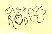
It's amazing what I've saved over the years in regards to projects I've been contracted to design. The simple Post-It note scribble at the left is just one example of the many preliminary concepts I have come across recently in archiving past projects.

Since I was a kid I have spent a great deal of time in the small Central Oregon town of Sisters, Oregon. The favorite backpacking destination of my family was the nearby Three Sisters Wilderness area. In the 1970's my parents bought property in Sisters, eventually building a vacation home that has been their primary residence for the past 15 years. For many years the Sisters Rodeo, "The Biggest Little Show in the World," has been a family tradition - with an annual weekend party at my parents' home that has become somewhat legendary.

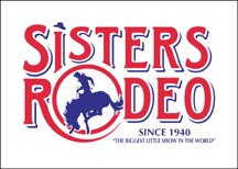
To celebrate the 60th anniversary of the Sisters Rodeo it was determined that it might be time for the organization to finally have an official logo. The Sisters Rodeo Association was already working with my sister's advertising agency, TriAd in nearby Bend, for their advertising, marketing and public relations needs. Sue's firm was asked to take on the identity project and she hired me to create the initial image for the rodeo. In one of our telephone discussions I jotted down a rough type treatment - for a logo that I hoped would convey a hint of the 1940's and be a lasting symbol for the Professional Rodeo Cowboys Association event.

From the beginning of the project I had no doubt the symbol representing this live-action piece of Western Americana would end up being red, white and blue in color. The flags, banners, music and patriotism associated with the rodeo immediately dictated that color palette. I also knew that I wanted a cowboy on a bucking bronco, or bull, as the primary element. Having seen many a cowboy hat fly through the air at previous rodeos, I felt graphically representing that would add a little implied movement - and my own little brand of humor - to the logo. The cowboy graphic fit well into the "O" of my original scribble, and the airborne cowboy hat became the dot of the "i" letterform in the word "Sisters," as the symbol almost designed itself.

The logo has served the event well the past six years - and received several honors. In 2000, the identity was included when the Sisters Rodeo was inducted into the Library of Congress “Local Legacies” archive. The following year the logo was honored with an Award of Merit in the Ad Federation of Central Oregon's annual Drake Awards, a Silver Award in the Summit Creative Awards, and received a LOGO 2001 honor (resulting in the design being published in the book The New Big Book of Logos). The design was also published in Logo Lounge : 2,000 International Identities by Leading Designers.

(This entry originally appeared on bLog-oMotives on December 30, 2005.)

© 2007 Jeff Fisher LogoMotives

Event Logos

(Clockwise from upper left)

Laugh Lover's Ball
Client: Laugh Lover's Ball
Location: Seattle, WA USA

The identity for an annual Seattle fund-raising event featuring nationally recognized comedians.

Learn more about this logo redesign project here.

Dinner at My House for Our House
Client: Our House of Portland
Location: Portland, OR USA

This pro bono design represents an annual fund-raising event for the AIDS/HIV residential care facility Our House of Portland. It appear in The New Big Book of Logos.

Lavender Law IV
Client: National Gay and Lesbian Law Association
Location: Washington, DC USA

Lavender Law is the conference of the National Gay and Lesbian Law Association. When the event was held in Portland I designed the logo and marketing materials.

Lucille Hart Dinner
Client: Right to Privacy PAC
Location: Portland, OR USA

The identity represented the annual fund-raising dinner of the Right to Privacy Political Action Group.

All logo designs © 2015 Jeff Fisher LogoMotives. All rights reserved.

Excavated Design Artifact #2

As I explained in an earlier post, I've been going through boxes of nearly 30 years worth of design work as I attempt to get my studio a bit more organized. In the process I've been coming across initial sketches that became final logos for many clients. Some of the doodles have been on Post-It notes, the backs of envelopes and little scraps of paper.

After initially meeting Don Horn - the founder of Portland's triangle productions! theatre company - at his very first opening night, I began designing logos, signage, posters, T-shirts, theatre programs and other items for his shows and theatre spaces. It was the start of what has become a 15+ year business relationship and friendship. Horn has always been one of my favorite clients; giving me complete creative freedom on the design projects. I have also been recognized with more design awards for the theatre projects than those for any other single client.

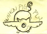
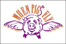
Over the years, I've had the opportunity to create logos for plays with great names. Soon after Horn told me he would be producing the show When Pigs Fly I scribbled a rough concept on a little yellow Post-It note. It immediately seemed natural that the curly tail of the pig would become the "S" in the show's name. The final design evolved directly from that sketch and made use of the colors selected for all promotional pieces for that year's schedule of productions. An added bonus was that the When Pigs Fly identity was recognized with an American Graphic Design Award from Graphic Design: usa and a Bronze Award from the Summit Creative Awards.

(This entry originally appeared on bLog-oMotives on December 13, 2005.)

© 2007 Jeff Fisher LogoMotives

Excavated Design Artifact #1

I'm not sure when I first started getting paid for actual design work. I remember earning income from some of my illustration work while still in junior high about 1970. I did have a paid, sit-at-a-desk, design job while in college as the designer for the advertising department of the University of Oregon college newspaper, the Oregon Daily Emerald. Using that 1978 job as a marker I've been working as a professional designer for nearly 30 years - and I have nearly every design project I've ever done saved in my personal archives.

I've initiated the process of trying to organize those files, boxes, drawers and piles of past design jobs. I'm learning just how little I've thrown away over the years. In the process of excavating my career I've found many little rough sketches for logo projects on napkins, envelopes, meeting notes, Post-It notes and other scraps of paper. Many of those initial, quickly-drawn creative thoughts evolved into final identity designs for my clients.

One such project was the personal logo design for the guy who began cutting my hair over a decade ago. In 1995 Jeff Maul asked if I could come up with an identity for his work as a Portland hair stylist. One day I scribbled a rough concept for his logo on a torn scrap of paper. When I finalized the design, it was the one and only design concept I presented to a very pleased client. I did follow the K.I.S.S. (Keep It Simple, Stupid) principle and eliminated the fingers elements I had included in the rough sketch. I was paid for the completed project in future haircuts.

The logo bought a great deal of attention to my design work, and became an important element in the focus of my design work changing to the creation of logos. One of the most recognized identities I've produced in my career, the logo appears in the books International Logos & Trademarks 3, Letterhead and Logo Design 5, New Logo & Trademark Design (Japan), Bullet-Proof Logos: Creating Great Designs Which Avoid Legal Problems, The Best in World Trademarks 1- Corporate Identity (Korea), LogoLounge, Volume 1, The Best of Letterhead and Logo Design, Logo Design for Small Business 2, and New Logo: One (Singapore). The logo also appeared in the 1996 PRINT Regional Design Annual. One simple, one-color logo has been marketing my design efforts, and appearing in new books, for ten years now.

In coming "excavated artifact" entries I'll share other rough design concepts (along with the final design) I find while digging in my home-based studio

(This entry originally appeared on bLog-oMotives on November 25, 2005.)

© 2007 Jeff Fisher LogoMotives