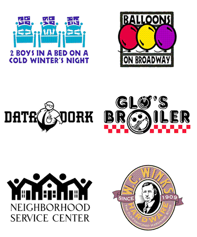
Jeff Fisher makes a name for himself making logos for others
Designing symbols of success
By Jim Hill of The Oregonian staff
When a 70-year-old Portland law firm wanted a company logo to help clients remember the firm, it gave Jeff Fisher a call.
Fisher, a Portland graphic designer and logo specialist, whipped out some preliminary sketches of two stacked law books. The books' covers and spines, viewed from one end, looked a lot like an S.
The S was in honor of Hy Samuels, who founded Samuels, Yoelin, Kantor, Seymour and Spinrad and died in 1992. The living partners -- Merritt Yoelin, Stephen Kantor, Steve Seymour and Alan Spinrad -- wanted the S because Samuels is a constant in the firm's name. They knew that if other names changed from time to time, a logo with an S still would be usable.
Fisher recalls turning out 16 designs after the first one, steering clear of the "scales of justice" images so often used in the legal profession.
But, as happens about 80 percent of the time, he said, the final version turned out to be a variation of the first idea he came up with: stacked law books. The firm uses the logo on its business cards, letterhead and newsletter.
"I do like it," Spinrad said. "These are big, heavy books. We are lawyers. I think the logo reflects stability, and ultimately that's our business. . . . We're rock solid."
The logo for the Samuels firm remains one of Fisher's favorites, he said, because it's bold and simple and because it has won him more design awards than any of his more than 200 logo designs.
Each job tests his creative skills.
"The exciting part of it is the challenge of trying to create a symbol that not only identifies the company, but also what it does," Fisher said. "The ideas can come to me while I'm in the shower or driving down the road, or sometimes in the first meeting with a client. When the client really loves my design, that's the most gratifying aspect of what I do."
Since 1995, when Fisher began concentrating on logos, his designs have been recognized with more than 100 awards and his work has been displayed in more than two dozen design publications.
Still, he's far from an overnight success.
From the time he was in grade school in Salem, he pursued his interest in art. He entered the University of Oregon as a fine arts major but shifted to graphic design, focusing on advertising and publications. After graduating in 1980, Fisher headed for Portland, where he found job prospects bleak amid recession-driven layoffs in the ad industry.
As a result, Fisher, now 42, toiled as an art director, freelance graphic designer and at other jobs for more than a dozen years in Portland and Seattle. Now, his specialty in logos has begun to bring him a more nourishing mix of clients and cash.
In early 1994, Fisher began doing logos for clients of his sister, Sue Fisher, who owns an advertising and public relations agency in Bend. "She kept me pretty busy," Fisher said. "She just really encouraged me to go in that direction."
Creating LogoMotives
In late 1996, Fisher formally adopted a logo design he had toyed with for 10 years and came up with a name for his business: Jeff Fisher LogoMotives.
He says its the best career move he's ever made. Working from his home studio in North Portland, he expects to gross about $90,000 this year, or nearly triple what he made before focusing on logos. After paying his overhead, consisting mostly of continuing upgrades of his computer equipment, Fisher thinks hell make $50,000 to $60,000 before taxes.
He now spends about 80 percent of his time turning out logos for small businesses, nonprofit agencies and performing arts groups. The cost of his services, he said, can range from $500 to $700 for a nonprofit client up to several thousand dollars for larger companies or particularly challenging projects.
Most of Fisher's clients are from Oregon and Washington, but he said he has done logo work for clients in 20 states and six foreign countries. Portland clients have included Winks Hardware, Balloons on Broadway, Old Town Clinic, Hamburger Mary's, the Oregon Gay & Lesbian Film Festival and the Triangle Productions nonprofit theater group.
One recent client was James John Elementary School in St. Johns. Fisher came up with a logo incorporating the landmark St. Johns Bridge with the school's name. His fee of $500 was raised by the PTA.
Principal Michael Verbout was first referred to Fisher when he needed a logo for the school's four-week summer program, called Project Safe Summer. When Fisher came up with an acceptable design, free of charge, it led to development of the school logo.
"Even if he's not getting any money from you, he wants it to be just perfect." Verbout said. "He just wants you to be satisfied with his work."
Verbout said the school logo is used on stationery, and on hats and T-shirts to promote school pride. Most people love the logo, he said, and say, "'Where'd you get this? This is fantastic.'"
Fisher's business, now 80 percent logo design, has grown steadily, even though he doesn't advertise and relies solely on referrals from satisfied clients.
"Based on the past three years," he said, "I would expect the growth to continue, especially as more and more small businesses open.
"That's my main client base. I really enjoy working with the small business owners who hire my business to help put theirs on the map."
© 2015 Jeff Fisher LogoMotives


