Jeff Fisher's neighborhood logo design efforts recognized at 'Celebrate North Portland' event

It's always nice to be recognized for one's work-related efforts, especially pro-bono activities in your own community - although it's never something to be expected. For me, the funny thing is that each time I've informed that I was to be publicly recognized at a neighborhood event, I've known I would miss the celebration due to traveling outside of the country. Such was the case in March 2011, while I was in on the island of St. Croix.

In late 2010, I learned that my volunteer neighborhood design efforts were to be acknowledged at a public dinner to be held on March 19th at the University of Portland. I was to be one of many residents to be honored at the event "Celebrate North Portland: Recognizing over three decades of activism in North Portland," hosted by my long-time friend and client, Mike Verbout.

Verbout, the former principal of James John School, also asked if I would create the logo to identify the dinner.

Schnitzer Steel, community activists Barbara Parmelee and Rich Recker, former Portland Mayor Vera Katz, columnist Steve Duin of The Oregonian and The Merck Family received plaques for their contributions to North Portland. Along with many businesses, organizations and individuals, I was honored to have a narrative describing my community work published in the evening's recognition book:

"Jeff Fisher, author of Identity Crisis!: 50 redesigns that transformed stale identities into successful brands (HOW Books, 2007), is the Engineer of Creative Identity for the North Portland-based firm Jeff Fisher LogoMotives. A 32-year graphic design veteran, he has been honored with over 600 regional, national and international design awards and is featured in over 140 books about logos, the design business, and small business marketing. His first book, The Savvy Designer's Guide to Success was released in 2004. Other book projects are currently in the works. He often travels – nationally and internationally – to present courses, seminars and workshops on design, branding, marketing and social networking.

In addition, Fisher is a nationally-recognized speaker, making numerous presentations each year to design organizations, design schools, universities and business groups. In 2009, Graphic Design USA magazine named Jeff Fisher one of its design industry “People to Watch.” Jeff Fisher LogoMotives is a past recipient of the Spirit of Portsmouth Award, Salvation Army’s North Portland Neighborhood Pride Award and the Portland Area Theatre Alliance B. Joe Medley Volunteer Award. Fisher is also Portland Rose Festival Character Clown Corps member Toots Caboose. Jeff and his partner, Ed Cunningham, have made Arbor Lodge their home for 15 years.

Past North Portland clients of Jeff Fisher LogoMotives have included James John School, Just Out, Peninsula Community Development Corporation, North Bank Cafe, Coyner's Auto Body, Lampros Steel, The Sentinel and DiPrima Dolci. The designer has donated his talents and abilities to create logos and other works for the North Portland Business Association, Project Safe Summer, Portsmouth Neighborhood Association, Peninsula Clean Team, Caring Community of North Portland, Kenton Neighborhood Service Center, Children's Relief Nursery, North Portland Neighborhood Services, St. Johns Window Project, Historic Kenton Firehouse Committee, The Salvation Army’s Moore Street Corps, and the North Portland Pride B.B.Q and Festival. He also designed the St. Johns street banners."

It's been a real pleasure to live and work in North Portland. I look forward to many more years of involvement in the vibrant community I call "home."

© 2011 Jeff Fisher LogoMotives

Jeff Fisher LogoMotives identity evolution

I get a lot of questions about the creation of the Jeff Fisher LogoMotives identity, especially as many designers struggle with the creation of their own logos. I was certainly no different.

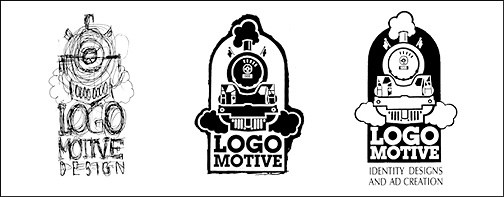
1987-1988

Almost eight years after moving to Portland from college, and beginning my career as a professional graphic designer, I determined I needed a business name that reflected my interest in logo design, combined with my lifelong fascination of toy trains and actual locomotives. The examples above show the development of a logo for, what I originally intended as the name, Logo Motive Design. The first drawing was executed in ballpoint pen on a notepad, recreated with a rapidiograph pen (this was before most designers had computers), and then reversed out to final art. The logo only appeared in one print ad. It was not met with positive feedback from friends and clients, who felt the emphasis on my personal skills and talent required my own name in my business identity. So, the idea was shelved and I continued as Jeff Fisher Design.

1991-1995

With more and more of my design work being involved in identity efforts I revisited my original concept for the business name Logo Motive. I attempted to create a logo combining the necessary text and a symbolic art element in an integrated emblem, while also conveying my own creativity and identity design ability. The rough design for the initial train imagery incorporating the name LogoMotive was even included in a 1991 self-promotion piece. I again received negative feedback from clients and associates in regards to such a name making my efforts seem impersonal and too corporate. Still, I began using the business name LogoMotive in 1995 to give an identification to what was unintentionally becoming my primary business focus. I again halted my own logo project out of frustration with it not conveying a strong enough image - and the effort becoming a low priority due to an ever-increasing workload.

1997

Early in 1997 I decided to finally finish the logo project I began ten years earlier for my worst client - myself. About 80% of my design projects were now logos. Potential clients, clients and friends were now asking why a logo designer did not have a logo of his own. My sister, Sue Fisher; owner of the advertising, marketing and public relations firm TriAd (in Bend, Oregon); encouraged me to focus on my logo design efforts and finalize my business identity. I embellished on the rough design of a couple years earlier. By simply adding my name to the design I was able to "brand" myself, giving the logo the personal sense it had been lacking. The result was a logo with which I was finally pleased and it has served me very well. To celebrate completion of the design, I bought myself the new toy train set I had always wanted.

These days about 35% of my new clients tell me they have made the decision to hire me based on my personal logo. The design has been honored with numerous design awards since first appearing long ago. The Jeff Fisher LogoMotives identity also appears in Letterhead and Logo Design 5 (1998), American Corporate Identity 14 (1998), New Logo & Trademark Design (Japan, 1998), the 1998 PRINT Regional Design Annual, The New Big Book of Logos (2000), PRINT’s Best Logos & Symbols 6 (2000), Logo Design for Small Business 2 (2004), Logos from North to South America (Spain, 2005), Logo & Trademark Collection (Japan, 2004), The Big Book of Business Cards (2005), American Graphic Design & Advertising 25 (2010), Type Rules: The Designer's Guide to Professional Typography, Third Edition (2010), 2011 Artist's and Graphic Designer's Market and a little book called The Savvy Designer's Guide to Success (2004).

© 2011 Jeff Fisher LogoMotives

Creative Services Logos


Client: Jeff Fisher LogoMotives
Location: Portland, OR USA

Being my own worst client, creating my own logo was a ten-year process. The identity is featured in Letterhead and Logo Design 5 (Rockport Publishers, USA, 1998), American Corporate Identity/14 (Hearst Books International, USA, 1998), New Logo & Trademark Design (P.I.E. Books, Japan -1998), the 1998 PRINT Regional Design Annual, The New Big Book of Logos (HBI, USA, 2000), PRINT’s Best Logos & Symbols 6 (RC Publications, USA, 2000), Logo Design for Small Business 2 (Signcraft, USA, 2004), New Logo & Trademark Collection (P.I.E. Books, Japan, 2004), The Big Book of Business Cards (Harper Design, USA, 2005), Logos from North to South America (Index Book, Spain, 2005), Logos Cafe (Page One, Singapore 2005), Logos from North to South America (Paper-mini, Index Book, Spain, 2005), Big Book of Business Cards (Paper, Collins Design, USA, 2008), Meishi - Little Graphic Art Gallery Of The World (International Creators Organisation, Japan 2009), Letterhead and Business Cards (Zeixs, Germany 2009), American Graphic Design & Advertising 25 (Collins Design, USA 2010), Type Rules: The Designer's Guide to Professional Typography (Wiley, Third Edition, USA, 2010), 2011 Artist's and Graphic Designer's Market (Writers Digest Books, USA, 2010), Logo Nest 03 - B&W Edition (Logo Nest, Serbia, 2014) and my own book The Savvy Designer’s Guide to Success (HOW Design Books, USA, 2004).

Read more about the Jeff Fisher LogoMotives identity evolution.

NoBox Design
Client: NoBox Design
Location: Portland, OR USA

This interior design company logo features a Donghia-like chair image and a "B" representing the client's first name, on a stylized blanket element. The logo was also created in a version without gradients for ease in reproduction in some applications. The NoBox Design logo was recognized with a 2006 American Corporate Identity Award and appears in The Big Book of Logos 5.

Twisted Elegance Interactive
Client: Twisted Elegance Interactive
Location: Seattle, WA USA

A very simple, artistic type treatment successfully conveyed the name of this company. The design was recognized in the P22 Font Foundry Font In Use competition, and appears in the books American Corporate Identity 2007 and The Big Book of Logos 5.

DesignEire
Client: DesignEire
Location: Dublin, Ireland

DesignEire was a web development company located in Dublin, Ireland. The design won a Summit Creative Award (Silver) and appears in the books The Big Book of Logos 3, New Logo World (Japan), Graphically Speaking, Global Corporate Identity, and Logo Design for Small Business 2. It was also critiqued by the UK newspaper The Sunday Times.

All logo designs © 2015 Jeff Fisher LogoMotives. All rights reserved.

Toot! Toot!*: New 'iheartlogos' volume gives love to Jeff Fisher LogoMotives identity designs

The recently released book iheartlogos season one includes design efforts from Jeff Fisher, the Engineer of Creative Identity for the Portland-based firm Jeff Fisher LogoMotives.. The inspiration-filled volume, published through the iheartlogos website, features 462 logos created by 109 designers from 26 countries around the world.

The Jeff Fisher LogoMotives designs selected (above) include the logo for Fontana, CA computer consulting firm DataDork and an identity concept for the Cat Adoption Team. Also showcased in the book is the logo for the Portland entertainment troupe Stumptown Clowns, of which designer Fisher is a member in his alter-ego persona of clown Toots Caboose.

Identities included in the book were judged and voted on by other designers submitting logos, and individuals registered to vote, at the website iheartlogos.com. The limited edition book is currently available exclusively on the site, for $25 - which includes free shipping in the continental United States. Season two of the iheartlogos competition is currently underway.

Fisher, a 30+ year design industry veteran, is the author of Identity Crisis!: 50 redesigns that transformed stale identities into successful brands and The Savvy Designer's Guide to Success: Ideas and tactics for a killer career. Other book projects are currently in the works.

The designer has received over 600 design awards and his work has been published in more than 140 books on identity design, self-promotion and the marketing of small businesses. He often travels – nationally and internationally – to present courses, seminars and workshops on design, branding, marketing and social networking. In addition, Fisher is a nationally-recognized speaker, making numerous presentations each year to design organizations, design schools, universities and business groups.

More information about Jeff Fisher, and his design and writing efforts, may be found on the Jeff Fisher LogoMotives blogfolio.

(* If I don’t "toot!" my own horn, no one else will.)

© 2011 Jeff Fisher LogoMotives

2010 Articles about Jeff Fisher LogoMotives

Articles, mentions of Jeff Fisher and sightings of Jeff Fisher LogoMotives designs online and in print:

Essential Logo and Identity Design Resources on Twitter, Logobird (October 2010)

Paper Cuts: All Aboard the Paper Train, by Tad Dobbs, The Squall Line (September 2010)

The Social Media Bible, @CEDIM (July 2010)

Top Graphic Designers Interviewed - The Sequel!, GraphicDesignBlog.org (May 2010)

Developing expertise in an industry or project type, by Neil Tortorella, NeilTortorella.com (May 2010)

How to Win A Design Competition, by HOW Editors, How Design (April 2010)

Career: How to Get Promoted, by Julie Anne Sims, HOW Magazine (April 2010)

Perpetual Logomotion, by Sean Thorenson, Inklings (April 2010)

In Depth With Jeff Fisher, by Brian Hock, designerID.com (March 2010)

Face to Face with Jeff Fisher, by Otba Mushaweh, Logo Talks (March 2010)

13 Must Follow Logo and Brand Identity Design Blogs, Logobird (March 2010)

Gay Marriage: Jeff Fisher and Ed Cunningham, by Christian Messer, id Magazine (February 2010)

Designers *First* Designs..., by Niki Brown, Design O'Blog (February 2010)

Do You Toot Your Own Horn? Jeff Fisher Does!, Against The Grain/Neenah Paper (February 2010)

Jeff Fisher LogoMotives | Facebook, Illustration Pages (January 2010)

A Look Back, A Look Forward, by The Creative Group, TCG eZIne (January 2010) © 2010 Jeff Fisher LogoMotives

Anatomy of a logo design

Several years ago my friend, and long-time client, Anne Kilkenny contracted me to design a logo for a grass roots community effort to oppose the inclusion of a "big box" hardware store in a new development proposed for construction on the east side of Portland's Willamette River. The site, at the end of the Burnside Bridge, was within a few blocks of numerous owner-operated smaller home improvement stores. Residential neighborhoods were nearby. The construction of a large retail store could have a tremendous negative impact on local business, the quality of life for neighbors and traffic.

I had worked with this client for years - including designing the award-winning identity for the nearly 100-year-old W.C. Winks Hardware store and the logo for her Heart of the Pearl retail development in the city's Pearl District. Kilkenny didn't need to provide much initial input on the project. It's just the way we've worked together over the years. I'd read the newspaper reports of the community issue and was familiar with the area in question. She gave me the rather clever acronym for the organization and set me to work. My one directive was to create something "that might look cool on a T-shirt."

I did a couple doodles on a piece a paper and then went directly to my PowerBook to fine-tune my one and only concept for the logo (above). Recently a friend was looking at the design and said "that's a design that would look really cool on a T-shirt, but what is it?" I gave a brief explanation of the concept behind the design and then my friend commented that it was "a really cool design."

In dissecting the design (above), I explained that the squiggly blue line (A.) represented the east bank of the Willamette River and one boundary of the area being impacted. The color blue was another representation of the water. Within the logo there are four abstract human forms (B.) representing the local community activists, the small business owners, other concerned citizens, and the public officials siding with the group. Together these four human forms created a circle (C.) signifying the unity of the various groups on this emotional community issue. Together the elements also created squares (D.) representative of Portland's grid system of small commercial and residential blocks in the area. I used upper and lower case letterforms on the AFriend element (E.), an acronym for Association for Responsible Inner Eastside Neighborhood Development, to make it seem friendlier and a little more neighborly for the group going up against the big corporations (and their lawyers) and city planners in dealing with the issue. A little last minute treatment was coloring the dot over the "i" blue to symbolically remind those involved that a single drop of water in a bucket can make a difference in the end result.

I don't know if my "cool" design had much of an impact on the outcome, but the developers of the project did end up going back to the drawing board to remove the "big box" retailers from their architectural plans.

The AFriend logo appears in The Big Book of Logos 5 and 100s Visual Logos & Letterheads (UK).

© 2010 Jeff Fisher LogoMotives

Toot! Toot!*: Jeff Fisher LogoMotives identities deconstructed in 'Design DNA - Logos' volume

Two logo designs by Jeff Fisher, the Engineer of Creative Identity for the Portland-based Jeff Fisher LogoMotives are featured in the newly released book Design DNA - Logos: 300+ International Logos Deconstructed. Written by brand consultant and designer Matthew Healey, the volume was published by HOW Books.

Design DNA - Logos analyzes over 300 exemplary designs from around the world; giving designers a clear understanding of how to target specific markets and convey brand values. Showcasing inspirational design, it is also a practical and problem-solving handbook covering general process and specific detailing. Every logo is deconstructed to show how each element works to make the design an effective one, and case studies walk the reader through the reasoning behind successful design decisions.

The Jeff Fisher LogoMotives designs presented in the book include the logo for the short-lived Balaboosta Delicatessen and the identity for VanderVeer Center.

Featured in the "Food & Drink" section of the volume, the Balaboosta logo (above center) was designed to compliment the neighboring local eating establishments of Portland chef and author Lisa Schroeder. The tile design and colors of the historic restaurant setting were incorporated into the logo design, referred to as "old-fashioned and tasteful" by Design DNA - Logos. Unfortunately, after a short time in operation, Balaboosta was closed and the restaurant space was reconcepted.

The VanderVeer Center identity (above right), an element of a total rebranding of the facility providing non-surgical cosmetic procedures, is cited in the volume for the "soothing" colors used in the design. The use of "naturalistic" typography is also recognized by the author, in the "Health & Beauty" industry logo example.

Fisher, a 30+ year design industry veteran, is the author of Identity Crisis!: 50 redesigns that transformed stale identities into successful brands and The Savvy Designer's Guide to Success: Ideas and tactics for a killer career. Other book projects are currently in the works.

The designer has received over 600 design awards and his work has been published in more than 140 books on identity design, self-promotion and the marketing of small businesses. He often travels – nationally and internationally – to present courses, seminars and workshops on design, branding, marketing and social networking. In addition, Fisher is a nationally-recognized speaker, making numerous presentations each year to design organizations, design schools, universities and business groups.

More information about Jeff Fisher, and his design and writing efforts, may be found on the Jeff Fisher LogoMotives blogfolio.

(* If I don’t "toot!" my own horn, no one else will.)

© 2010 Jeff Fisher LogoMotives