Over the years some of my own most enjoyable, challenging and visible identity design projects have been those for restaurant industry businesses. Much of the pleasure comes from an ability to push the creative envelope a bit and not be limited by the often-conservative boundaries of much more corporate identity design. I usually have an opportunity to be more playful with restaurant logos and have more fun with color. In addition, the architecture of the buildings, the design of the interiors, the type of food to be served and other elements come into play. The challenges of such projects most often raise their ugly heads in the form of budget limitations and the lateness of some restaurant owners to initiate the logo/identity design process for their new business in a timely manner – especially when the scheduling of projects for other vendors are overlooked. The visibility, and multiple uses, of the completed eating establishment image is a valuable marketing tool for a designer as easily recognizable public exposure of one’s design work. Unfortunately, with something like 50% of all restaurants closing in the first two to three years in business the visibility of such design examples often is limited in duration. (That figure is not necessarily more dramatic than the failure rate of other start-up businesses – the boarding up of a local dining establishment is often just more evident to the average person viewing from the street.)
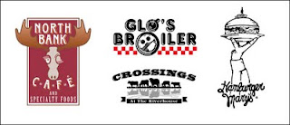
For over 20 years I’ve been having fun with the design of restaurant logos. In my own work I do tend to include a playful quality in most of the projects. Within the retro image for the Seattle breakfast establishment Glo’s Broiler the keen-eyed viewer will find the lower-case “g” letterform created by the cup of coffee and plate of food. The basic logo design was also easily adapted to “Glo’s Boys” for the sponsorship of gay community athletic teams. The Hamburger Mary’s location, in the same city, was represented upon its opening by the image of a hand and arm holding up a burger in homage to the silhouette of the city’s landmark Space Needle. The Caribbean theme of Indies Restaurant & Bar, in New York City, was conveyed with a palm tree and the “i” letterform in the name being replaced with an illustration of a man playing a steel drum. The font for the name, and all menu headings, evolved from hand-cut tin letters I saw used in rustic signage while once visiting several islands in the tropical region. Ten years later I have yet to finish designing the entire alphabet.

The Central Oregon steak house Crossings is located at a historic Deschutes River cattle crossing. The graphic of cattle, with a reflection in the water, was a natural solution to the client’s location-based design element request. The owner of the North Bank Café wanted a fun “Northern Exposure” look for her business. She suggested a winking female moose with long eyelashes as a possible image. Since a female moose doesn’t have the familiar large antlers we both decided that the resulting graphic is a representation of a wilderness female impersonator. Celilo was the original restaurant and lounge in Portland’s historic Governor Hotel – for which I did the entire corporate identity. Much of the imagery, and interior design, for the hotel project was inspired by the Lewis & Clark expedition to explore the unsettled Pacific Northwest. Incorporating letterforms from the original journals of the pioneer explorers created the logo text. The espresso machine identity for La Patisserie was one of my first restaurant logos, and it served the business for many years before it closed.
One from Column A and one from Column B
Designers often experience a variety of positive and negative aspects in creating graphic imagery for restaurants. For Tracy Moon, of StudioMoon, one of the pleasures of such work is the immediacy of their impact. “With many identities you never have a clear gauge as to how they are received by the intended audiences,” say Moon. “With restaurants (and hotels and other “retail” environments) you can get feedback which is more timely, direct and personal - on an ongoing basis.”
Creative Madhouse principal, and Creative Latitude member, Madelyn Wattigney grew up in New Orleans surrounded by restaurants and cafes. “I developed a love for good food, the pleasure of enjoying a meal, a cup of coffee, or good conversation in a relaxing environment,” she explains. “I thoroughly enjoy the art of cooking, and combining these ingredients with my love for design is what makes the nature of this particular type of project so rewarding.”
“Also, I find it gratifying to create a logo that evokes a pleasurable dining feeling and has the consumer anticipating the experience,” Wattigney adds. “Then there’s always the added enjoyment of ‘wowing’ the client and having them say, ‘You nailed it!’”
“Let’s face it, restaurants are just plain fun to design for!,” according to John Sayles of Sayles Graphic Design. “Many times the restaurant’s concept or theme is the springboard for my designs.”
“On the other hand, if it’s a start up restaurant – and the food concept is still being developed – my logo can set the tone for the establishment,” says Sayles. “I especially like to work on projects where the logo is the starting point and I get to work on the things that follow: interior graphics, menus, uniforms, even advertising and promotion.”
Dan Stebbings, of the firm Fresh Oil, finds that designing for restaurants brings culture, ethnicity and a sense of place into the firm’s work. “We've been fortunate enough to collaborate with a range of interesting and talented people; owners, chef's, interior designers and artisans who make each project unique and the work fun,” says the designer.
In the other column of the restaurant design menu are some of the frustrations and challenges previously mentioned in regards to such projects. The firm Fresh Oil finds that construction and opening fundings are often much more generous than initial operating budgets. “It’s often disappointing to see a design program with great potential be cut way back once the “essentials” are in place…and the most daring and exciting concepts get canned for a more ordinary one with much less potential,” according to Stebbings. “This often happens when we’re brought into the project too late and the concept’s been locked down with no room for new ideas.”
Tracy Moon agrees that the industry is so centered around other elements that affect overhead such as the cost of food and less tangible activities, such as identity and marketing are often left to the end of the planning process - or forgotten altogether.
“I have actually had restaurateurs call and ask me to create advertising for them when they didn't have a logo or a color scheme, or a visual identity of any kind,” Moon says. “Many of them just aren’t focused on this critical aspect of their venture until they meet with us, and by then it is do-able, by it can be too late in terms of budget, timing and the implementation of key elements such as printed materials, awnings, signing, and other applications.”
Often a restaurant’s logo is the only marketing tool they have especially if they do little to no advertising. For Creative Madhouse, one challenge is to keep this in mind during the design process — always remembering the “K.I.S.S” (Author’s note: Keep It Simple, Stupid) factor. Wattigney feels that keeping the design simple and clean will pay off in the end.
“A restaurant’s logo needs to speak volumes in the blink of an eye…it needs to evoke a good feeling and make the consumer feel confident about eating there,” adds Wattigney. “It’s the designer’s challenge to accomplish all of this in a very limited amount of space.”
John Sayles says, “The most challenging part about designing logos for restaurants is seeing a vision for a place and not being able to convince the owner to be flexible and to incorporate new ideas. It can also be frustrating when you know the name of the restaurant just isn’t quite ‘there,’ like when the owner is fixated on some oddball or hard to pronounce thing. Another challenge – from a business perspective – is the high failure rate for restaurants. No one likes to get stiffed!”
A smorgasbord of design challenges
Specific logo projects bring about veritable buffet of design and process challenges. Each restaurant identity confronts a designer with a unique selection of potential obstacles.

When taking on the Raccoon River Brewing Company (RBBC) identity project Sayles Graphic Design found they had several owner/investors involved in the project and to complicate matters further, they all lived in different parts of the country. Getting them all on the same page at the same time was difficult.
“As far as the logo, it was somewhat challenging trying to nail down exactly the right look for the raccoon,” says Sayles. “I wanted him to look friendly and sociable without seeming childish.”
Sayles continues, “On a side note, RBBC was sold to new owners a year or so after it first opened. The new owner got rid of my logo and redesigned a new raccoon character. I swear it is the most hideous, amateurish thing I have ever seen. Usually the “before” logo is God-awful and the “redesign” is a big improvement. Not this time. I still have a hard time going in there and looking at the thing. Their beer is pretty good though!”
“With Jalapeno Pete’s, animating something as character-less as a pepper means that as an artist, I had to give a food item a persona. The logo needed to be simple because of the environment in which it appeared,” Sayles adds. “The cantina is located on the Iowa State Fair grounds, and is only open during the eleven-day run of the state fair each year. In this case the owner was a visionary. He asked good questions and listened to my answers. He made me want to work extra hard and do my best. He is successful because he finds people who are good at what they do and then he lets them do it!”

In explaining Fresh Oil’s work with Tou Bagaille, a romantic beach bar restaurant located on St. Maarten in the Caribbean Islands, Stebbings recalled, “The restaurant is owned and all logo applications were produced by island locals - with very thick accents! So, when it came to communicating via telephone, a lot of repetition and patience was required. The other challenge was trying to work with a client and vendors who were using seriously dated software and equipment. Following up and making sure files sent via the Internet went through OK took a lot of repetition and patience, too.”
“I didn’t know it at the time, but when I started working on the Big Fish logo, three designers had already given up on the project,” says Stebbings. “The owner of Big Fish is a great chef and restaurateur with lots of creative energy who, through the process of working with the others, had figured out exactly what he wanted the logo to be - or so he thought.”
Stebbing continues, “As a result, I had to capture his vision and I wanted to put some of myself into it, too. He had become so frustrated with earlier attempts, I saw this as an opportunity to go beyond what he expected. This took 15 rounds of revisions with numerous iterations sprinkled into each one. The end result is a logo he loves that he puts on everything he can. Last, the entire opening of Big Fish was being filmed for a Canadian television show so, on a few occasions I had to meet with the owner on site and present concepts to him in front of a camera & crew!”
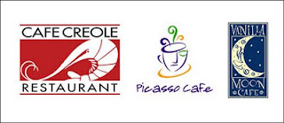
For Creative Madhouse, the Café Creole, Picasso Cafe and Vanilla Moon Café logo projects all had one similar challenge — distance from the client. All three clients were located hundreds of miles from the designer’s studio in Fort Worth. Through the use of modern technology — phone calls, email communication, online proofing, faxing and overnight shipping - these difficulties were quickly overcome.
“Since telepathic communication is not a prerequisite for being a graphic designer I need to rely upon other tools when working with a long distance client,” Wattigney says. “I utilize an in depth logo questionnaire, phone calls, and my gut instinct when interpreting a client’s thoughts, vision and dream for their new identity.”
The Lenox Room identity project is a good example of some of the challenges described by Moon earlier. She literally had about 10 days to do the work, from concept to delivered printed materials. The architect on the project, Wendy Tsuji, brought the designer in on the effort – not the owner.

“The architect was having some very expensive brass push bars made for the front glass revolving doors of the restaurant and was horrified that they didn't have high-quality graphics to go on them,” according to Moon. “She asked them if she could rectify the problem and they said, in effect, sure - as long as it’s done by next week!”
The “Lenox Room” identity won the James Beard Foundation Award for Restaurant Graphics in North America.
The Lenox imagery is a “facelift” done for “Lenox Room” about 8 years after it originally opened. In order to appeal to a younger, hipper, less affluent clientele the owner asked StudioMoon to update the identity previously created by the same firm – while hopefully retaining some of the elements of the original identity so people would know that management was the same. The name was shortened to “Lenox” and new look, and feel, was designed for the restaurant.
21st Amendment was a young brewery, restaurant and bar near the new baseball park in San Francisco whose owners had named the establishment after the amendment repealing prohibition. It did well with the ballpark crowd, especially on game days, and with beer aficionados in general.
“When they came to me they were drowning in a lot of home-spun graphics, hand-drawn cartoons and archival photos centered around the beer protests from the 20’s, says Moon. “It was cute, and fun, but not cohesive.”
For StudioMoon the challenge was to bring the 21st Amendment into the 21st century without losing the flavor and approachable feel they had cultivated in this “Cheers”-like place. Moon replaced their tagline “We Want Beer” with the more sophisticated and creative “Beer Here.” With other graphic changes she was able to create a consistent identity without making the business seem too corporate.
Recipes for the restaurant logo design process
Different designers use different tools and ingredients to create logo images. I was designing logos for almost two decades prior to a computer appeared on my desk. The first program I learned to use was Freehand and all the identities I’ve produced since then have been executed with that particular software.
“I’m a bit old school, I remember when there were no graphic design software applications ….I still start my logo design with a jar full of sharpened pencils and a sketchbook,” says Wattigney. “Once I have the concepts I usually scan the pencil sketches and then redraw.”
In executing her concepts and final files she utilizes Macromedia Freehand almost exclusively, but works with Adobe Illustrator and Adobe Photoshop when necessary.
Adobe Illustrator and Photoshop were used by Stebbings to create the Big Fish and Tou Bagaille images, however both logos retained the feel of his original pencil sketches. For the two Lenox restaurant identities, Moon used Adobe Photoshop for all photographic imagery, and Adobe Illustrator for typography. The 21st Amendment logo process utilized the Adobe InDesign software. Sayles and his staff use Adobe Illustrator for the majority of the logos they design.
Research is part of the design process for any logo or identity. Some unusual research is sometimes required when executing such projects for food industry establishments. My own restaurant logo projects required tasting a wide variety of foods, drinking numerous espresso drinks and having a cocktail or two. In the case of the Celilo image I needed to do quite a bit of research on the historical aspects of the project, and I worked closely with the chef on the “feeling” he wanted for the dining room.
Tracy Moon needed to understand the evolving nature of the Upper East Side clientele of the Lenox restaurants and how to appeal to them visually at different times in the history and evolution of the same restaurant.
“In the case of 21st Amendment, I needed to research and understand the Prohibition era, as well as immerse myself in the brewing process because, first and foremost, this is an on-site brewery,” says Moon. “And, of course, I had to try (desperately) to understand the mind set of the “Beer Guy.”
“For the Raccoon River Brewing Company, no ‘research’ was needed because I live in a raccoon-infested wooded area … my inspiration is everywhere,” says the principal of Sayles Graphic Design. “Jalapeno Pete’s is a Mexican cantina, so I drank mucho margaritas before starting work on that one!”
“Capturing Tou Bagaille’s Caribbean essence was important on this project, and the design really needed to fit with the surroundings - particularly as it applied to signage,” Stebbings says. “So, I looked through my honeymoon photos which were shot on a neighboring island for good examples of hand-painted signs, colorful buildings and clothing. I also referred to artwork purchased on the islands for inspiration.”
“I felt like the research for Big Fish mostly involved getting inside the head of the owner and getting to understand what he was after,” adds the Fresh Oil designer. “Once I had managed that, I also looked at the coloring of exotic fish and tropical underwater seascapes, reviewed some Circus and Carnival imagery, and watched old WB cartoons, too - which helped me stay sane through the numerous revisions.”
“The Vanilla Moon Café project required me to endure multiple trips to similar type cafes while consuming copious amounts of gourmet coffee,” Wattigney says. “It was a hard job, but someone had to do it. I also referenced my morgue of existing package labels from the food industry and researched celestial/planetary images.”
While researching the Picasso Café project, Wattigney surrounded herself with art history books about Picasso’s work to get a sense of how best to express the essence of Picasso while still maintaining an original design for the logo.
“Café Creole was an easy research,” according to Wattigney. “I needed only to walk out my front door and breathe in the city of New Orleans and order up a few pounds of boiled seafood for additional inspiration.”
A full menu of end results
Some of the greatest exposure of a designer’s efforts in creating a restaurant identity comes from the wide variety of applications of the image. I have had logos used on aprons, hats, food festival banners, doggie bags, drink coasters and many other items.
Fresh Oil’s Tou Bagaille logo was applied to signage, business cards, menus, t-shirts and baseball caps. The Big Fish logo was applied to moving, neon-lit signage, stationery, menus - including a scratch and sniff dessert menu, 8 varieties of private-label soda, embroidered and silk-screened apparel, postcards, temporary tattoos, event banners and advertising.
Each of the logos designed by Creative Madhouse has been utilized in the traditional manner: signage, menus, stationery, t-shirts, aprons, and other applications. Vanilla Moon Café took it one step further and had moon ornaments, matching the logo, created as Christmas gifts for their patrons. Picasso Café also had the icon etched into the glass of their front windows.

StudioMoon’s incarnations of the Lenox imagery found their way onto signage, menus, matchbooks, business cards, stationery, postcards, advertising, specialty promotional materials, glassware, posters and brass pushbars. The 21st Amendment logo is used on many similar items and the brewery’s Web site, banners, commemorative items, assorted clothing items and a readerboard outside of the restaurant.
“Raccoon River Brewing Company initially used the logo I created for a number of items including: signage, menus and on beer glasses, and for a short time the new owners were using both the old and new logo while they made the switch,” says Sayles. “I still laugh when I think about my friends going in and asking for their beer in ‘an old glass.’”
“Jalapeno Pete’s used the logo for signage and apparel, including clever t-shirts that said ‘I Ate the Whole Enchilada!’ and ‘Drink ‘til You Want Me,’ Sayles adds. “They always sell out of those.”
Designing identities for restaurants and bars is fun, challenging, at times a bit aggravating and provides a designer a highly visible result for the effort. It will often leave them hungry for more of the same type of project.
Contributors to this article:
Madelyn Wattigney/Creative Madhouse • Dallas/Fort Worth, TX
Dan Stebbings/Fresh Oil • Pawtucket, RI
John Sayles/Sayles Graphic Design • Des Moines, IA
Tracy Moon/StudioMoon • San Francisco, CA
Jeff Fisher/Jeff Fisher LogoMotives • Portland, OR
Note: This article was previously posted in its original format on the design industry site Creative Latitude.
© 2009 Jeff Fisher Logomotives


