Showing posts with label bLog-oMotives. Show all posts

Excavated Design Artifact #19

As I continue to sort through boxes of past project files, I've found some excavated artifacts other than my own doodles. I recently came across a file of faded thermal paper faxes of client concepts for their own logos.

One such effort was a 1995 project for a Bend, Oregon client, Deschutes Plumbing. I was provided with three rough sketches and color suggestions for the plumbing contractor's business (above). The client wanted snow- capped mountains, trees, and a river flowing down the mountainside with a drop of water coming out of a faucet - or possibly two faucets. I was also given the directive "Colors: blue (water), forest green (trees, lettering)."

I don't know about the rest of you, but my first impression was a very clear image of a woman's breasts in the doodles - and knew that would not represent the business well. Still, within the rough ideas there were bits and pieces that could make up a much more concise, clean and usable identity design.

I immediately eliminated the idea of small tree elements, as they would most likely add too much detail to the design. I was able to incorporate graphic elements to represent the nearby Three Sisters Mountains and the Deschutes River. The letterforms "D" and "P" where drawn to resemble pipes, complete with a drip of water coming from the tap imagery. The color requests of the client were implemented as well. All of the elements were incorporated in a circular shape for ease of use in ads, collateral materials and vehicle signage.

The resulting image is still in use by the business 13 years later. It was also featured in the Japanese book New Logo & Trademark Design; later released in paperback by PIE Books as Logo and Trademark Collection.

© 2008 Jeff Fisher LogoMotives

Excavated Design Artifact #18

The cleaning out of old files, and archiving of past design projects, continues - and I haven't even touched a four-drawer filing cabinet and several boxes of files stored in my basement. My collection of project elements from the past 30 years is a bit overwhelming. I seem to have enough "excavated artifacts" and "before and after" project examples to fill an entire book - perhaps I should write one on those specific topics.

I just came across my rough concept for a publication called The Reel Scoop (below left). While living in Seattle in 1987, I was contacted by a potential client who was initiating a new monthly newspaper, which was to provide parents with the information they needed to know about movies their children might might want to see. The identity for the paper needed to appeal to both kids and adults.

My rough concept is actually a little more detailed than many of my "excavated artifacts." The design, in black felt pen on a now yellowed piece of tissue paper, shows a piece of film incorporating the words "THE REEL" over the word "SCOOP," created from hand-drawn letterforms and the graphic image of movie camera. Prior to presenting the idea to my client, as a photocopy, I attempted to clean it up a bit with the Liquid Paper and white tape seen on the original design.

This one and only concept shown to the client evolved into the final logo with no major alterations (above right). It was easy for readers to find the movie review publication on newsstands and bookstores with the attention-getting logo used as the nameplate across the top of the front page.

Due to the incorporation of the art as letterforms in the name, David E. Carter used The Reel Scoop identity as an example in his book Bullet-Proof Logos: Creating Great Designs Which Avoid Legal Problems.

(This post originally appeared on bLog-oMotives.)

© 2008 Jeff Fisher LogoMotives

Excavated Design Artifact #17

I recently received the latest issue of Flying House Magazine, the current publication of the Seattle Men's Chorus and Seattle Women's Chorus. An article in the magazine reminded readers that the 2009-2010 will mark the 30th anniversary of the Seattle Men's Chorus (SMC). I'm pleased to have been part of the graphic history of the SMC for quite a few years and recently, as I continue to archive my 30 years of project elements, I came across a large file of design concepts for the group.

As mentioned in a previous "excavated artifact" entry, I once shared office space in Seattle with the performing arts organization. Back in 1987, one of the first projects I executed for the Chorus was an identity.

In my old project files I found a number of black felt pen concepts, sketched on sheets of typing paper, for what would become the Seattle Men's Chorus logo. My first doodle included a little black bow tie as a design element over the "M" in a "SMC" representation. As is the case in about 80-85% of my logo design projects, this initial "brain fart" would remain a constant throughout much of the logo creation process and end up playing a major role in the final image.

Some other rough concepts (above) included an image of a man in a tuxedo (which I would incorporate into a future season ticket brochure design for the SMC), a bolder treatment of the SMC/bow tie idea, and a silhouette of a conductor using the Space Needle as a baton. Additional ideas (below) included more Space Needle imagery, an elegant intertwined monogram image, a clef note flipped to represent the "S" letterform, and an emerald-shaped border (a reference to Seattle's "Emerald City" nickname and the gay community's attachment to the film The Wizard of Oz).

With an office staff, good-sized Board of Directors and large membership of singers, this project could have become a "design by committee" nightmare. However, I worked one-on-one with the SMC marketing director, who seemed to steer the project effortlessly through the process by submitting a very limited number of concepts to decision-makers. In my files I found his own feedback in the form of a doodle suggesting that my heavy "SMC" image, with the bow tie, be incorporated within an emerald shaped border. The result, hand-drawn in the pre-computer time - with spray glued typesetting dropped into place, was finalized as the logo for the Seattle Men's Chorus (below).

The identity was very successful in one color (sometimes black; sometimes emerald green), as a metallic foil image, foil-stamped in gold on some items and in a variety of treatments on wearables. It served the Seattle Men's Chorus well until the organization was rebranded by the Phinney/Bischoff Design House in 2005 - nearly two decades later.

My association with SMC continued through the early 1990's; even after I had moved back to Portland. During that time I designed several season ticket brochures, designed and produced numerous event programs, created print ads and invitations, did design work for the international GALA Choruses Festival when held in Seattle, and much more.

I also created a number of additional identities for SMC (above). A logo was produced to represent the major donors' organization, the Seattle Men's Chorus Director's Circle. I designed the initial SMC donor publication, Chorus Quarterly, and its identity. As SMC moved into publishing of programs for other performing arts organizations, I adapted the organization logo to brand its new Emerald City Arts department. My favorite has always been the identity for Philandros, a sub-group of the Seattle Men's Chorus.

I always look back on my work with SMC fondly. It was an incredible opportunity to work with a dynamic arts organization and all the wonderful people involved.

(This post originally appeared on bLog-oMotives.)

© 2008 Jeff Fisher LogoMotives

Excavated Design Artifact #16

In the late 1980's, while living in Seattle, I shared offices with several entities that were clients, or later became clients. The Seattle Men's Chorus, the Pride Foundation, City Guide Magazine and Alice B. Theatre were the other tenants in the combined space in what was an energetic, creative and fun working environment.

Alice B. Theatre was founded in 1984 in conjunction with the first Gay and Lesbian Theatre Festival in Seattle. The theatre company name is a reference to Alice B. Toklas - the confidante, lover, cook, secretary, muse, editor, critic, and general organizer of writer Gertrude Stein. In 1933 Stein published her memoirs under the title The Autobiography of Alice B. Toklas. Toklas released her own book, The Alice B. Toklas Cookbook, in 1954. A memoir containing a collection of recipes, it is probably best known for its instructions on making cannabis brownies (which later played a role in the plot of the 1968 Peter Sellers movie I Love You, Alice B. Toklas). In old photos Toklas is often seen wearing a big floppy hat.

My workspace next door neighbor, Alice B. Theatre, made use of my design services in creating print ads, flyers, posters and other items for the live theatre performances presented in the local community. The one thing the group was lacking was a strong graphic identity. At some point I suggested to the organization's director that it might be worthwhile to put some time and energy into creating a logo for the group.

As my present day office cleaning attests, I began doodling my ideas for the image on just about any paper surface I came across. The first was a a pencil sketch on a page from a memo pad given to me from a printer in Lynnwood, WA. On a scrap torn off a yellow, lined legal notepad was another rough concept done in a think black felt pen. Yet another idea was executed in India ink on a piece of tracing paper. (Yes, I've saved these things for two decades!)

Each concept included a reference to the floppy hat once worn by Alice B. Toklas. Another common element was at least one evident triangle shape, creating a bow, as a symbolic tip of the hat to the primarily gay and lesbian target audience of the performing arts group. The font University Roman, which had been used on some previous theatre marketing and promotion materials, was the typeface given the most consideration throughout the process.

As I fine-tuned the concept from the legal tablet I decided the logo was a bit too flat, long and skinny. I felt as if the hat needed more weight and presence in the identity. The treatment of the font related back to my earliest doodle on the printing company memo sheet.

I've always liked the final logo design and the image it conveyed for the the theatre company. Unfortunately, I moved back to Portland before any kind of full-fledged branding effort could be introduced. According to documentation in the Special Collections of the University of Washington Libraries, Alice B. Theatre disbanded in the spring of 1996 and reorganized as Alice B. Arts in September 1996. It then ceased operations completely in 1997.

In reviewing the 20-year-old logo today, I might have designed one portion of the image differently. The big and small caps, used in the organization name, may have been replaced with the cleaner, more simple, all caps treatment displayed in the concept making use of the long, thin hat graphic. It always bugged me that the tagline was broken into two elements in my final design. It would have been read much more easily as one complete line under the Alice B. Theater name.

(This post originally appeared on bLog-oMotives.)

© 2008 Jeff Fisher LogoMotives

Excavated Design Artifact #15

The bit of my design career past I found this past week is different than most of my previously posted excavated artifacts. In addition to filing away examples of past logo design projects, I've been going through a stack of old articles written about my work and archiving them. I came across a clipping, from the U.K. newspaper The Sunday Times, in which a logo I designed is critiqued by Lisa Godson. In my entire career it is the only piece of my work reviewed by a major publication.

The logo was created for a web development firm in Dublin, Ireland by the name of DesignEire. The project was one of the first international projects I had done entirely by way of the Internet. The review appeared as part of Godson's regular column "Designer Ireland" on June 6, 2004.

No. 237: DesignEire

The most impressive item in DesignEire’s portfolio is themselves — or rather their logo. It has won international awards, been featured in graphic design manuals as an example of excellence and is utterly distinctive.

The logo is a representation of the D and E of the company name, and plays on visual perception. The letters are placed back to back, this snugness an allusion to their part in a composite word. The E is a curved Celtic uncial, and so at first glance the design appears to depict two back-to-back semi-circles.

It seems almost abstract, with the negative space formed by the two curves emphasised visually by being rendered in white. As the brightest element in the composition, the eye is drawn first to this non-signifying abstract shape — the leftover part of the design forming the central focus, in a subversion of the norm.

Another unusual aspect of the design is the use of dark colours. The shape enclosed by the D is in indigo, and that of the E in a dark leaf green. The allusion here seems to be to cosmopolitanism on the one hand and the local on the other. With a name like DesignEire, it is clear the company wants to be associated with Ireland, but it also works for international clients. The logo is certainly more subtle than the cheeky name — the use of the terms design and Eire make it sound like an official state design organisation rather than a small commercial firm.

The appeal of the logo is not just a cerebral one of optical illusions and allusions but an emotional one. The letters and shapes of it are all marked out in thick black line, and coupled with the strong colours gives it a hand-drawn, child-like air. It is designed as much as an illustration as a corporate trademark — in fact, it is more suggestive of the work of Roger Hargreaves, creator of the Mr Men books than that of a contemporary graphic designer.

Lisa Godson is tutor in Critical and Historical Studies at the Royal College of Art. She was previously a lecturer in the Department of the History of Art, Trinity College Dublin, Dublin Institute of Technology and elsewhere, wrote a weekly column on Irish design for the Sunday Times for six years, and worked as a curator and consultant to the National Museum of Ireland. Godson also wrote the limited edition book Stealing Hearts from a Travelling Show: The Graphic Design of U2.

As mentioned in the review, the DesignEire logo did receive its fair share of additional recognition. The design won a Summit Creative Award (Silver) and appears in the books The Big Book of Logos 3, New Logo World (Japan), Graphically Speaking, Global Corporate Identity, and Logo Design for Small Business 2.

It's interesting to look back on the critique of the design. The simplicity of the finished design has always made it one of my personal favorites. Once again, I'm glad I never throw anything away.

(This entry originally appeared on bLog-oMotives).

Content of review © Copyright 2007 Times Newspapers Ltd.

© 2008 Jeff Fisher LogoMotives

Excavated Design Artifact #14

Yet additional proof that I never throw anything away. In a box of unfiled clutter I just found a business window envelope with a phone message note and a doodle made after returning a previous client's phone call.

The client, Lisa Fritsch of the Diva Salon, was considering opening a new hair and nail establishment in the renovated Pearl District building housing the headquarters of the ad firm Wieden & Kennedy. Negotiations were underway for the lease of the space and she wanted to proceed on the identity for the new business with the name "Page Six." It was a reference to the New York Post column by the same name, and the tagline for the salon was to be something like "Hair & nails that are talked about."

As my client described the business, and how she imagined the logo, I doodled a bit on the envelope (above left). She mentioned she had sketched something out herself, with her daughter's crayons on a sheet of notebook paper (above right), and asked if I wanted to see it. I told her I thought I had a good idea of what she wanted and I would go ahead with creating the initial concept. A few days later, I presented my concept (above center) and we were both stunned at how close my design was to her own doodle.

Then the unexpected happened. The lease negotiations came to an end. My client needed to rethink her business plan and look at new locations. A short time later she leased a renovated auto repair shop. Her "Page Six." name really didn't fit the new facility and it was scraped - but not before the logo design was accepted for publication in The Big Book of Logos 3.

(This post originally appeared on bLog-oMotives.)

© 2008 Jeff Fisher LogoMotives

Excavated Design Artifact #13

I am a doodler. In the never-ending process of sorting through, and archiving, design projects from throughout my career, I am finding that I doodle a lot. I'm also learning that I must have never thrown anything away. Well, that last point has changed a bit. I've already taken 1.5 pickup truck loads of paper, cardboard and magazines to the neighbor- hood recycling center.

The other day I came across a folded catalog envelope. In unfolding the paper, I found the notes from a telephone conversation with Karen Fisher (no relation), made while she was living in Ogden, Utah. Karen is actually the mother of one of my partner's best friends from high school. She had come up with a business concept for building cupboards that would be placed in antique malls, and other suitable locations, to sell antiques, collectibles, gifts and other items ranging in price from $1 to $100.

The business name of "WhatNots" had been established; as had the tagline of "A Cupboard Collection of Spunky Stuff."

As the conversation continued, I doodled - including a small sketch of an antique cupboard; based on one I use as a china cabinet in my own dining room. My client said she would send me a photo of the one in her home (at right), which was the inspiration for her business model.

While we were talking, I was designing in my head. I immediately "saw" the business name "WhatNots" broken in two, with each half conveniently containing four letterforms. At the center of the logo would be the graphic image of the cupboard. With the description of the business, an "Arts & Crafty" type treatment was my only consideration. My cupboard illustration had a rough look to it and I felt the font Willow was a great solution. (The font was also used on a previous "excavated artifact.") I even used the period character from the font to create the knobs of the drawers and doors in the cupboard illustration.

The final WhatNots identity has always been a personal favorite. In addition, it won a LOGO 2000 award and appears in the book The Big Book of Logos 3.

(This post originally appeared on bLog-oMotives.)

© 2008 Jeff Fisher LogoMotives

Excavated Design Artifact #12

Over a nearly 30-year career a designer does seem to accumulate a lot of "stuff" - especially when it seems nothing has ever been tossed out in the trash or recycled. My design studio housecleaning continues. I've been cleaning and cataloging my dusty advertising collectibles. The same is being done with my library of design books going back to my high school days. This past week I made sure that the contents of hundreds of old floppy disks from 1992-1997 were properly backed up and stored. See what I mean about never throwing anything away?

I am safely storing away doodles and sketches for logo designs, and other projects, that I've come across while cleaning out files and boxes. One pieces of paper, a laser printout of a letterhead for an engineering firm, displays the original doodle for my Jeff Maul logo, a couple others for clients of the advertising agency owned by my sister, and three sketches for what would become the identity for WordWright.

In 1994, Kimberly Webster came to me to create an identity for her technical, business and grant writing efforts. Her company name was to be WordWright. She wanted an image that projected a hand-wrought quality, conveying the sense of her work being done by a traditional craftsperson.

In my twisted little mind I immediately saw an image of pens and a pencil forming a rustic "W" icon. The doodles above, done with a fine-point black pen, show the progression of my thoughts to a final logo concept.

The font ITC Willow seemed like an appropriate "fit" with the graphic imagery. The combination resulted in a strong one-color identifying symbol for Webster's Portland-based business.

Webster moved to Seattle in 1997 and felt it was necessary to update the logo in introducing herself to a new market of potential independent project clients. With her last name beginning with a "W," the solution was simple. Her name was given the Willow type treatment and she was ready to take on her new business market.

A couple years later Webster called me to announce she was getting married and her logo once again needed to be altered. I've always accused her of seeking out someone whose surname began with a "W." With the married name of "Waters," a type change was all the change required.

This past year there was yet another name change. As this alteration required changing the established icon for the first time, I will write about it in a future Re-Design bLog-oMotives entry.

The original WordWright image made an appearance in the Japanese book New Logo & Trademark Design - republished in paperbook as Logo and Trademark Collection. In its "Kimberly Webster" form the identity was featured in the 1998 Print Regional Design Annual and the Japanese book Logo World. The "Kimberly Waters" logo is included in Letterhead and Logo Design 7, Logo Design for Small Business 2, The Big Book of Logos 3 and the Spanish book Logos: From North to South America (which will soon be released in paperback).

(This post originally appeared on bLog-oMotives.)

© 2008 Jeff Fisher LogoMotives

Excavated Design Artifact #11

Sorting through 30 years of files and boxes of old design projects is a major undertaking. I've been doing it for several months now and I've only made a small dent in the archives of my work. I'm also archiving old project floppy and zip disks as I dig through the stuff in my home-studio. Still, I guess that it's a good thing I seldom throw anything away.

The other day I was going through a box of old papers and came across a page of media contacts. Many of the names had been crossed out. Phone numbers were scribbled all over the page. I couldn't imagine why I might have saved the piece of paper. I turned it over and discovered numerous phone messages, obviously transcribed from my old answering machine. There were some other messy mindless sketches at the top of the page. Doodled at the bottom was the image of a television set, a micro- phone and a newspaper - the beginnings of one of my favorite initial logo efforts.
In the early 90's I started doing contract design work for an independent public relations and marketing specialist by the name of Denny Shleifer. Shortly after starting our business relationship, he asked if I could design a new logo for his business - something that was more dynamic and fun than the image he was using at the time. Shleifer brought an energy to his work that I hadn't experienced in many people in his industry and he was a great deal of fun to be around.
The doodle above, surrounded by other notes, was obviously done while I was on the phone with someone else. The black ink of the drawing matches some other notations. It immediately captured the persona of Denny Shleifer.

Once in a while there are those logo concepts that I just know will be the identity to represent the client. This was one of those situations. I remember showing Shleifer the final concept and he responded with "Wow, this is me!"

The design provided me additional confidence in my logo design abilities when it was selected to be included in the Rockport Publishers book Letterhead & Logo Design 4. Years later it was featured in The Best of Letterhead & Logo Design.

In 1995 Shleifer incorporated his business and changed the official name to Shleifer Marketing Communications, Inc. The altered name required a few adjustments in the logo. I unsuccessfully tried to convince my client that "Inc." did not need to be in the new image. Still, it didn't seem to be too distracting in the revised identity.

The new Shleifer logo got additional exposure in the books International Logos & Trademarks 4, Letterhead & Logo Design 5, More Logos & Letterheads, and the Japanese offerings New Logo & Trademark Design and Logo & Trademark Collection.

(The post originally appeared on bLog-oMotives on July 10, 2007.)

© 2008 Jeff Fisher LogoMotives

Excavated Design Artifact #10

The sorting through backed-up digital files, filing cabinets and boxes continues in my home studio as I archive over 30 years of design work. Recently I came across a somewhat mangled photocopy of a page from an old PRINT Regional Design Annual. In looking over the images on the page, I had no idea why I might have made a copy of this particular selection of design images. However, when I looked on the backside of the piece of paper, two pencil sketches of what would become the logo for the Seattle restaurant Glo's Broiler were evident.

When living in Seattle in the late 1980's, I developed a personal connection with the Capital Hill eatery. The late Glo Raineri, the founder of the breakfast and lunch cafe - and the mother of one of my closest friends - was also my roommate. I was one of a number of young men who, at various times, rented rooms in her house, which was sometimes referred to as "Glo's Home for Wayward Boys." Her restaurant became a natural extension of that life and I ate many meals in the place. That I would eventually design the logo for the place was no surprise.

I especially enjoy designing restaurant identities. There's often an incredibly creative challenge in capturing the essence of an eating establishment in an eye-catching and concise logo image to represent a business entity that conveys a very specific theme or food style. In the past, I wrote about such design projects in the Logo Notions article Designs on dining: Restaurant logos as a graphic invitation to a meal and an experience.

For me, Glo's Broiler had the feeling of an old-fashioned diner and that type of imagery came to mind as possible logo elements - neon, sytlized illustration, chrome, a checkerboard tablecloth, and red vinyl upholstery. My first pencil sketch (above) tilted a square border into a diamond shape, and introduced a steaming coffee cup as a replacement for the "o" in the word "Glo's;" while a plate of a common breakfast entree became the "o" in "Broiler." The second doodle (at right) eliminated the confining border and hinted at the type treatment - which I already knew would make use of the font Frankfurter Highlight. It's interesting that in the revised concept the addition of a checkerboard base can barely be seen on the paper. I erased it from the drawing whole working on the logo creation.

As the identity design developed, the bacon, eggs and toast graphic took inspiration from a similar image in a silkscreen print I had produced, and sold through several galleries, years earlier. In a "happy accident," the placement of the coffee cup and plate created a lower-case "g" - a secondary representation of "Glo." The checkerboard imagery then returned to give the logo some balance and weight.

With the completion of the logo, it was decided to do T-shirts to market the restaurant. A snide comment from a guy in a bar, referring to me as one of "Glo's boys," resulted in an additional "Glo's Boys" logo being creating and it became the identity for a bowling team the restaurant sponsored.

Glo, given the name of "Mother of Capital Hill" by Seattle newspapers, passed away in October of 2005. The restaurant remains open, although the logo has not been used for some time. Still, the image lives on in the books Bullet-Proof Logos, Logo Design for Small Business 2 and the Japanese volume New Logo and Trademark Design (which was recently re-released as the paperback Logo and Trademark Collection).

(The post originally appeared on bLog-oMotives on May 23, 2007.)

© 2008 Jeff Fisher LogoMotives

Excavated Design Artifact #9

The design studio housecleaning continues. There are boxes of old design concepts and projects that haven't been touched in at least a decade. Here's another example of a logo design concept I recently came across.

Back in 1997 a close friend was discussing the possibility of opening a retail store that focused on outdoor bird houses, various bird seed products and related items for the gardener looking to invite wild birds into their landscapes. During an afternoon conversation a brain-fart resulted in the name "For the Birds" being realized for the venture. I told the friend I would be thrilled to create the logo for the business while she did necessary further research on the business.

A few days later I scribbled out a potential design, with a black ballpoint pen, on the back of a folded piece of laser paper from my recycle bin (actually a printout of my own then recently completed Jeff Fisher LogoMotives identity is on the other side of the sheet). The scribble has a bird house graphic as its centerpiece, with the opening to the residence as the letterform "O" in the word "FOR." Little doodles of bird images sit on top of the letters "B" and "S" from "BIRDS."

I obviously wasn't completely pleased with the concept. On the reverse side of a fax printout, along with a collection of phone messages and client appointment notes, is an additional rough sketch of the design idea. This one has a bird as the "B" letterform in the word "BIRDS."

The two concept drawings were combined - with the addition of a leafy tree branch for balance - to create the final logo design, which has always been a personal favorite. In the end, my friend never opened her bird house store as her career went off in another direction. However, the logo design has lived on in the books New Logo & Trademark Design (Japan), Bullet-Proof Logos, The New Big Book of Logos and Logo & Trademark Collection (Japan).

(This entry originally appeared on bLog-oMotives on April 27, 2007.)

© 2008 Jeff Fisher LogoMotives

Excavated Design Artifact #8

I am continuing to sort through and archive over 30 years of design projects as I organize my home studio. It amazes me how much concept and process documentation I have filed away over the years. I seems a possible book on my 30+ years is evolving as I find more such materials all the time - and I haven't even started converting years of floppy disks to more stable archival vehicles.

Recently I came across the original planning meeting notes for a 1995 AIDS organization fundraising event to be called "Coffee Cares." The sheet of notebook paper listed a variety of possible event names and taglines. As the meeting progressed I scribbled out a possible logo design in ball point pen - based in part on the design of my own previous logo design for the Seattle restaurant Glo's Broiler. By the time the meeting was adjourned the event identity was created in my mind and on my page of notes.

My rough sketch included a roughed out intrepretation of the font Frankfurter Highlight for that retro cafe look, a checkerboard pattern above and below the event name, a space for the yet-to-be-determined tagline and steam coming off the coffee cup in the form of the AIDS ribbon.

Within a day my final logo concept was created, presented and accepted by the event planners. Little changed from the original scribble. I did drop the checkerboard pattern above "Coffee Cares" and the space reserved for the tagline was moved from the left to the right - now filled with the message "Baristas, bakeries & bistros supporting people with AIDS."

The image was very successful in drawing attention to the city-wide event in Portland and the fundraiser added to the coffers of local AIDS organizations. The logo was also featured in the books Restaurant Graphics 2, Typography and Blue is Hot,Red is Cool: Choosing the Right Color for Your Logo.

(This entry originally appeared on bLog-oMotives on March 19, 2007.)

© 2008 Jeff Fisher LogoMotives

Excavated Design Artifact #7

I'm continuing the ongoing process of going through 30+ years of files as I organize and catalog all my old graphic design files. Numerous times I have opened a folder or envelope to find an original doodle of what would eventually become a completed logo for a client.

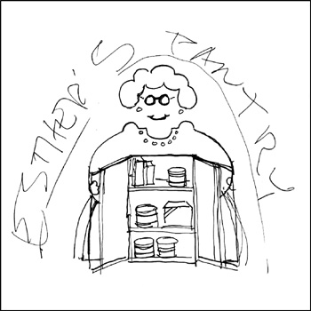
In 1995 I sketched out a rough concept for a pro bono logo for the Portland nonprofit organization Esther's Pantry. Esther’s Pantry was founded in 1985 to provide individuals living with AIDS access to food and personal care items they themselves might not be able to afford. The organization was named in memory of Chester "Esther" Brinker, one of the first people in Portland to die of complications from AIDS.

Still, my take on "Esther" was meant to cause people to smile through the suffering and pain of the continuing AIDS crisis. I saw Esther as a bit of a "flasher," opening her jacket to reveal what was on the shelves of the "pantry." The female character in the design is actually a fairly good graphic representation of my late great-grandmother Osie Saltmarsh Cantrall Norris - a Southern Oregon pioneer and one of the most incredible people in my life.

In March 2000, the pantry transferred its operation to MCC Portland (I designed their logo in 1995 as well) and I was asked to redesign the logo as a grocery bag image that I never liked much. In fact, I've never even included that design in my portfolio. It was determined that my "Esther" - used in a limited fashion for a while - was a bit glib and possibly controversial.

I was very pleased when my Esther's Pantry logo was honored in the 1995 PRINT Regional Design Annual. I still smile each time I come across the image - and I'm sure that great-grandma gets a kick out of it, too.

It's great that Esther's Pantry continues on - with, it appears, an even newer logo. Each month 150 to 200 clients are allowed to select their groceries and personal care items from well-stocked shelves, rather than being handed a pre-packed box of food.

(This entry originally appeared on bLog-oMotives on December 30, 2006.)

© 2008 Jeff Fisher LogoMotives

Excavated Design Artifact #6

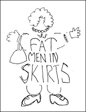
In his Right Brain Reader article, Away from the sketch pad; away from the struggle, Philip Bailey mentioned the logo I had designed for the theatrical production Fat Men in Skirts. Having done the logo about a decade ago, I had not thought about the image in some time - and then the other day I came across my original sketch for the identity on a scrap of laser paper that I had filed away.

I've been designing logos for triangle productions! theatre presentations for over 16 years. Producer/director Don Horn has been a dream client. He'll throw some odd play or musical name my way and leave me alone to create the identity for the show. He seldom even requests any changes in the designs. In this case, the production was to be playwright Nicky Silver's show Fat Men in Skirts.

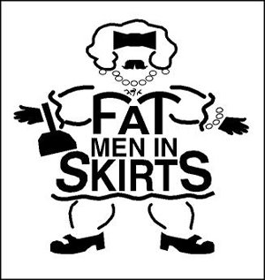
I almost immediately had an image for the logo in my mind - kind of a cross between a middle-aged thick manly man and someone's pleasantly plump grandmother - with curly black chest hair. I quickly sketched out a rough design and then proceeded to take the image to the computer. In my digital design I wanted to maintain some of the qualities of the rough drawing - without giving the "fat man" too much detail.

The show was yet another successful local theatre production. My logo design had some success as well. It was recognized by the PRINT's Regional Design Annual at the time and was published in the Japanese design book New Logo & Trademark Design - which was recently republished in paperback as Logo and Trademark Collection.

(This entry appeared on bLog-oMotives on September 26, 2006.)

© 2008 Jeff Fisher LogoMotives

Excavated Design Artifact #5

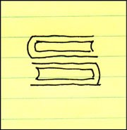
Recently, while cleaning out a box of old unfiled business papers, I came across a doodle that was to become one of my most successful logo designs. As it is the identity for a law firm, it is somewhat appropriate that the sketch is on a piece of a yellow legal pad. Creating a logo for a law firm can bring about many challenges. In addition to the partners in the business name, there are usually at least a few other lawyers who desire to claim some ownership in regards to selecting a final design. In such situations a designer needs to tactfully perform the "design by committee" dance. It can also be tough to convince the members of a legal firm to stray from the traditional conservative designs often used to promote such a company. It is necessary to convey that creating an original image positions the firm as unique in the market.

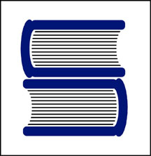
The identity process for the Portland law firm Samuels Yoelin Kantor Seymour & Spinrad went through numerous somewhat complicated iterations before one of the main partners in the firm suggested returning to an early, very simple concept. That design was a graphic interpretation of two thick law books creating the “S” letterform – representing the name Samuels, designated as the one constant in any future name changes. In a moment totally unrelated to meeting with the attorneys, while on the phone with another client, I drew out my initial thoughts with a felt tip pen. In fine-tuning the design I made the "books" come across as much more like the heavy legal volumes I'd seen in the firm's office bookcases. With some prodding by the one partner advocating the image, the icon was adopted by the firm and it has served them well over the past decade.

The design brought a great deal of attention to my identity creation efforts. The logo appeared in a PRINT Regional Design Annual, won a LOGO 2000 award, and received a Bronze in the Summit Creative Awards. The design was also published in the books International Logos & Trademarks 4, Letterhead and Logo Design 5, The Big Book of Logos, Global Corporate Identity, The Best of Letterhead and Logo Design, and the Japanese volume New Logo & Trademark Design (which has been re-released in paperback as Logo and Trademark Collection).

(This entry originally appeared on bLog-oMotives on September 19, 2006.)

© 2008 Jeff Fisher LogoMotives

Excavated Design Artifact #4

It's amazing what I find while cleaning out old files. I guess I should be pleased that I've seldom thrown anything away during my career. There, stuck in a totally unrelated file folder, was a piece of paper with couple of phone messages from sometime in 1986 when I was sharing office space with City Guide Magazine, the Seattle Men's Chorus, the Alice B. Theatre company and the Pride Foundation. The yellow paper has even more yellowed scotch tape on it and a thumb tack hole where I probably stuck it on a bulletin board at some point. The messages said "Jeff Hest called - will be at the Ritz @ 5 pm" and "Ken D. called." Jeff was one of my best buddies when I lived in Seattle, the Ritz Cafe (long since closed) was one of our favorite bars, and Ken D. (Decker - now long deceased) was a great friend and client.

The phone messages were not why I've saved the scrap of paper for about 20 years. Also on the paper were the doodles of what were to become a logo and T-shirt design.

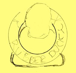
The late 80's found the U.S. dealing with the ever-growing AIDS crisis. At the time I was doing design work for a number of AIDS and health organizations in both Seattle and Portland. Part of my work involved getting safe-sex messages across to the general public. I'd been kicking around the idea of a graphic proclaiming "A Rubber's Ducky" - or, in other words, "a condom is a good thing" - for some time. Obviously, that idea manifested itself in the sketches on a message pad.

The original concept was for the traditional rubber ducky we played with as a kid to have its head sticking out of a nautical life preserver. The text "Rubber Ducky" appears in the first very rough sketch. The beginnings of what were to be the duck image, with a hint of rope, appear in the second rough.

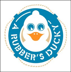
As the design was fine-tuned, the life preserver took on the more realistic look of those on a friend's boat. The duck somehow developed the reservoir tip of a condom on the top of its head and - in the stencil type often seen on sea-going vessels - the text became "A Rubber's Ducky." The result is still one of my personal favorites in the vast collection of identities I've designed. In part, I'm sure due to the cute and clever incorporation of the serious safe-sex message. A few T-shirts were produced for friends back then. Mine has long since worn out. Perhaps it's time to produce a new batch for the current generation that might benefit from the message.

The image has kind of taken on an international life of its own. It appears in the Japanese book New Logo & Trademark Design (republished in paperback as Logo and Trademark Collection), the first book in the LogoLounge series and in the recent Spanish volume Logos from North to South America. It also was recognized with LOGO 2001 honors and, as a result was published in the book The Big Book of Logos.

The process of going through 30 years of design files is tedious and somewhat exciting. I'm cataloging and archiving all examples of my work - and certainly not throwing anything away. I'll be sharing more past projects in the future.

(This entry originally appeared on bLog-oMotives on August 5, 2006.)

© 2007 Jeff Fisher LogoMotives

Excavated Design Artifact #3

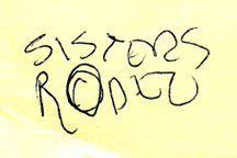
It's amazing what I've saved over the years in regards to projects I've been contracted to design. The simple Post-It note scribble at the left is just one example of the many preliminary concepts I have come across recently in archiving past projects.

Since I was a kid I have spent a great deal of time in the small Central Oregon town of Sisters, Oregon. The favorite backpacking destination of my family was the nearby Three Sisters Wilderness area. In the 1970's my parents bought property in Sisters, eventually building a vacation home that has been their primary residence for the past 15 years. For many years the Sisters Rodeo, "The Biggest Little Show in the World," has been a family tradition - with an annual weekend party at my parents' home that has become somewhat legendary.

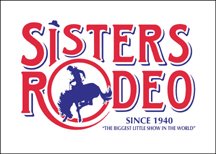
To celebrate the 60th anniversary of the Sisters Rodeo it was determined that it might be time for the organization to finally have an official logo. The Sisters Rodeo Association was already working with my sister's advertising agency, TriAd in nearby Bend, for their advertising, marketing and public relations needs. Sue's firm was asked to take on the identity project and she hired me to create the initial image for the rodeo. In one of our telephone discussions I jotted down a rough type treatment - for a logo that I hoped would convey a hint of the 1940's and be a lasting symbol for the Professional Rodeo Cowboys Association event.

From the beginning of the project I had no doubt the symbol representing this live-action piece of Western Americana would end up being red, white and blue in color. The flags, banners, music and patriotism associated with the rodeo immediately dictated that color palette. I also knew that I wanted a cowboy on a bucking bronco, or bull, as the primary element. Having seen many a cowboy hat fly through the air at previous rodeos, I felt graphically representing that would add a little implied movement - and my own little brand of humor - to the logo. The cowboy graphic fit well into the "O" of my original scribble, and the airborne cowboy hat became the dot of the "i" letterform in the word "Sisters," as the symbol almost designed itself.

The logo has served the event well the past six years - and received several honors. In 2000, the identity was included when the Sisters Rodeo was inducted into the Library of Congress “Local Legacies” archive. The following year the logo was honored with an Award of Merit in the Ad Federation of Central Oregon's annual Drake Awards, a Silver Award in the Summit Creative Awards, and received a LOGO 2001 honor (resulting in the design being published in the book The New Big Book of Logos). The design was also published in Logo Lounge : 2,000 International Identities by Leading Designers.

(This entry originally appeared on bLog-oMotives on December 30, 2005.)

© 2007 Jeff Fisher LogoMotives

Excavated Design Artifact #2

As I explained in an earlier post, I've been going through boxes of nearly 30 years worth of design work as I attempt to get my studio a bit more organized. In the process I've been coming across initial sketches that became final logos for many clients. Some of the doodles have been on Post-It notes, the backs of envelopes and little scraps of paper.

After initially meeting Don Horn - the founder of Portland's triangle productions! theatre company - at his very first opening night, I began designing logos, signage, posters, T-shirts, theatre programs and other items for his shows and theatre spaces. It was the start of what has become a 15+ year business relationship and friendship. Horn has always been one of my favorite clients; giving me complete creative freedom on the design projects. I have also been recognized with more design awards for the theatre projects than those for any other single client.

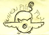
Over the years, I've had the opportunity to create logos for plays with great names. Soon after Horn told me he would be producing the show When Pigs Fly I scribbled a rough concept on a little yellow Post-It note. It immediately seemed natural that the curly tail of the pig would become the "S" in the show's name. The final design evolved directly from that sketch and made use of the colors selected for all promotional pieces for that year's schedule of productions. An added bonus was that the When Pigs Fly identity was recognized with an American Graphic Design Award from Graphic Design: usa and a Bronze Award from the Summit Creative Awards.

(This entry originally appeared on bLog-oMotives on December 13, 2005.)

© 2007 Jeff Fisher LogoMotives

Excavated Design Artifact #1

I'm not sure when I first started getting paid for actual design work. I remember earning income from some of my illustration work while still in junior high about 1970. I did have a paid, sit-at-a-desk, design job while in college as the designer for the advertising department of the University of Oregon college newspaper, the Oregon Daily Emerald. Using that 1978 job as a marker I've been working as a professional designer for nearly 30 years - and I have nearly every design project I've ever done saved in my personal archives.

I've initiated the process of trying to organize those files, boxes, drawers and piles of past design jobs. I'm learning just how little I've thrown away over the years. In the process of excavating my career I've found many little rough sketches for logo projects on napkins, envelopes, meeting notes, Post-It notes and other scraps of paper. Many of those initial, quickly-drawn creative thoughts evolved into final identity designs for my clients.

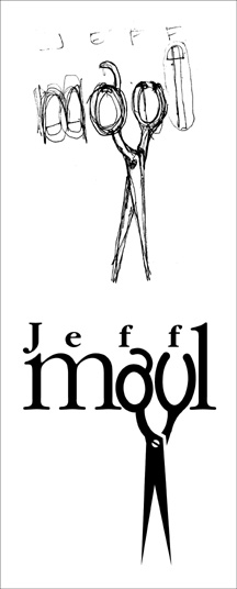
One such project was the personal logo design for the guy who began cutting my hair over a decade ago. In 1995 Jeff Maul asked if I could come up with an identity for his work as a Portland hair stylist. One day I scribbled a rough concept for his logo on a torn scrap of paper. When I finalized the design, it was the one and only design concept I presented to a very pleased client. I did follow the K.I.S.S. (Keep It Simple, Stupid) principle and eliminated the fingers elements I had included in the rough sketch. I was paid for the completed project in future haircuts.

The logo bought a great deal of attention to my design work, and became an important element in the focus of my design work changing to the creation of logos. One of the most recognized identities I've produced in my career, the logo appears in the books International Logos & Trademarks 3, Letterhead and Logo Design 5, New Logo & Trademark Design (Japan), Bullet-Proof Logos: Creating Great Designs Which Avoid Legal Problems, The Best in World Trademarks 1- Corporate Identity (Korea), LogoLounge, Volume 1, The Best of Letterhead and Logo Design, Logo Design for Small Business 2, and New Logo: One (Singapore). The logo also appeared in the 1996 PRINT Regional Design Annual. One simple, one-color logo has been marketing my design efforts, and appearing in new books, for ten years now.

In coming "excavated artifact" entries I'll share other rough design concepts (along with the final design) I find while digging in my home-based studio

(This entry originally appeared on bLog-oMotives on November 25, 2005.)

© 2007 Jeff Fisher LogoMotives