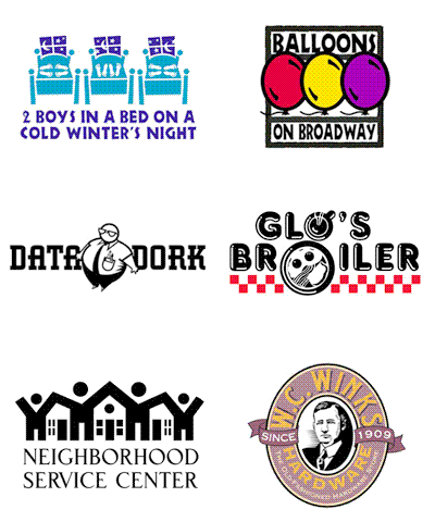
 The sorting through backed-up digital files, filing cabinets and boxes continues in my home studio as I archive over 30 years of design work. Recently I came across a somewhat mangled photocopy of a page from an old PRINT Regional Design Annual. In looking over the images on the page, I had no idea why I might have made a copy of this particular selection of design images. However, when I looked on the backside of the piece of paper, two pencil sketches of what would become the logo for the Seattle restaurant Glo's Broiler were evident.
When living in Seattle in the late 1980's, I developed a personal connection with the Capital Hill eatery. The late Glo Raineri, the founder of the breakfast and lunch cafe - and the mother of one of my closest friends - was also my roommate. I was one of a number of young men who, at various times, rented rooms in her house, which was sometimes referred to as "Glo's Home for Wayward Boys." Her restaurant became a natural extension of that life and I ate many meals in the place. That I would eventually design the logo for the place was no surprise.
I especially enjoy designing restaurant identities. There's often an incredibly creative challenge in capturing the essence of an eating establishment in an eye-catching and concise logo image to represent a business entity that conveys a very specific theme or food style. In the past, I wrote about such design projects in the Logo Notions article Designs on dining: Restaurant logos as a graphic invitation to a meal and an experience.
 For me, Glo's Broiler had the feeling of an old-fashioned diner and that type of imagery came to mind as possible logo elements - neon, sytlized illustration, chrome, a checkerboard tablecloth, and red vinyl upholstery. My first pencil sketch (above) tilted a square border into a diamond shape, and introduced a steaming coffee cup as a replacement for the "o" in the word "Glo's;" while a plate of a common breakfast entree became the "o" in "Broiler." The second doodle (at right) eliminated the confining border and hinted at the type treatment - which I already knew would make use of the font Frankfurter Highlight. It's interesting that in the revised concept the addition of a checkerboard base can barely be seen on the paper. I erased it from the drawing whole working on the logo creation.
 As the identity design developed, the bacon, eggs and toast graphic took inspiration from a similar image in a silkscreen print I had produced, and sold through several galleries, years earlier. In a "happy accident," the placement of the coffee cup and plate created a lower-case "g" - a secondary representation of "Glo." The checkerboard imagery then returned to give the logo some balance and weight.
With the completion of the logo, it was decided to do T-shirts to market the restaurant. A snide comment from a guy in a bar, referring to me as one of "Glo's boys," resulted in an additional "Glo's Boys" logo being creating and it became the identity for a bowling team the restaurant sponsored.
 Glo, given the name of "Mother of Capital Hill" by Seattle newspapers, passed away in October of 2005. The restaurant remains open, although the logo has not been used for some time. Still, the image lives on in the books Bullet-Proof Logos, Logo Design for Small Business 2 and the Japanese volume New Logo and Trademark Design (which was recently re-released as the paperback Logo and Trademark Collection).
(The post originally appeared on bLog-oMotives on May 23, 2007.)
© 2008 Jeff Fisher LogoMotives


