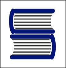
 Recently, while cleaning out a box of old unfiled business papers, I came across a doodle that was to become one of my most successful logo designs. As it is the identity for a law firm, it is somewhat appropriate that the sketch is on a piece of a yellow legal pad. Creating a logo for a law firm can bring about many challenges. In addition to the partners in the business name, there are usually at least a few other lawyers who desire to claim some ownership in regards to selecting a final design. In such situations a designer needs to tactfully perform the "design by committee" dance. It can also be tough to convince the members of a legal firm to stray from the traditional conservative designs often used to promote such a company. It is necessary to convey that creating an original image positions the firm as unique in the market.
The identity process for the Portland law firm Samuels Yoelin Kantor Seymour & Spinrad went through numerous somewhat complicated iterations before one of the main partners in the firm suggested returning to an early, very simple concept.  That design was a graphic interpretation of two thick law books creating the “S” letterform – representing the name Samuels, designated as the one constant in any future name changes. In a moment totally unrelated to meeting with the attorneys, while on the phone with another client, I drew out my initial thoughts with a felt tip pen. In fine-tuning the design I made the "books" come across as much more like the heavy legal volumes I'd seen in the firm's office bookcases. With some prodding by the one partner advocating the image, the icon was adopted by the firm and it has served them well over the past decade.
The design brought a great deal of attention to my identity creation efforts. The logo appeared in a PRINT Regional Design Annual, won a LOGO 2000 award, and received a Bronze in the Summit Creative Awards. The design was also published in the books International Logos & Trademarks 4, Letterhead and Logo Design 5, The Big Book of Logos, Global Corporate Identity, The Best of Letterhead and Logo Design, and the Japanese volume New Logo & Trademark Design (which has been re-released in paperback as Logo and Trademark Collection).
(This entry originally appeared on bLog-oMotives on September 19, 2006.)
© 2008 Jeff Fisher LogoMotives


