Identity Re-Design: Laugh Lover's Ball

The Laugh Lover's Ball - An Evening of Sophisticated Silliness! is an annual February event in Seattle. The evening usually involves a host of national and local comedians performing a number of comic genres including: sketch, stand-up, poetry, music and some audience participation gags.

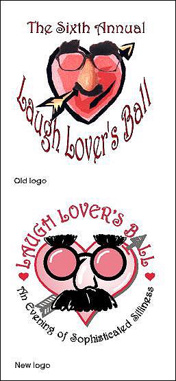
In late 2001 Seattle comedian David Crowe contacted me to redesign the identity for the comedy event held each Valentine's Day. For the previous six years a collage of art elements, photo imagery and distorted type had been combined in a logo representing the night of comedy. Crowe felt it was time to create a strong, simple, cleaner symbol to represent the fundraising event from year to year. I was asked to create a new identity that would maintain elements of the logo already in use. While continuing to use their signature font Harrington, I incorporated the arrow tip as the "A" letterform in the word "BALL." A more graphic representation of the "Groucho Marx" glasses/nose combo was used to illustrate a face on the heart idea "borrowed" from the original design and the tagline for the evening was included in the new logo. Years later the revamped logo is still representing this great event.

(Note: My new book, Identity Crisis!: 50 Redesigns That Transformed Stale Identities Into Successful Brands, contains case studies from 35 designers and firms located around the world. Learn more about the book on the Identity Crisis! blog.)

© 2008 Jeff Fisher LogoMotives

Excavated Design Artifact #9

The design studio housecleaning continues. There are boxes of old design concepts and projects that haven't been touched in at least a decade. Here's another example of a logo design concept I recently came across.

Back in 1997 a close friend was discussing the possibility of opening a retail store that focused on outdoor bird houses, various bird seed products and related items for the gardener looking to invite wild birds into their landscapes. During an afternoon conversation a brain-fart resulted in the name "For the Birds" being realized for the venture. I told the friend I would be thrilled to create the logo for the business while she did necessary further research on the business.

A few days later I scribbled out a potential design, with a black ballpoint pen, on the back of a folded piece of laser paper from my recycle bin (actually a printout of my own then recently completed Jeff Fisher LogoMotives identity is on the other side of the sheet). The scribble has a bird house graphic as its centerpiece, with the opening to the residence as the letterform "O" in the word "FOR." Little doodles of bird images sit on top of the letters "B" and "S" from "BIRDS."

I obviously wasn't completely pleased with the concept. On the reverse side of a fax printout, along with a collection of phone messages and client appointment notes, is an additional rough sketch of the design idea. This one has a bird as the "B" letterform in the word "BIRDS."

The two concept drawings were combined - with the addition of a leafy tree branch for balance - to create the final logo design, which has always been a personal favorite. In the end, my friend never opened her bird house store as her career went off in another direction. However, the logo design has lived on in the books New Logo & Trademark Design (Japan), Bullet-Proof Logos, The New Big Book of Logos and Logo & Trademark Collection (Japan).

(This entry originally appeared on bLog-oMotives on April 27, 2007.)

© 2008 Jeff Fisher LogoMotives

Identity Re-Design: Cooke Stationery

As an artistic kid growing up in Salem, Oregon I would often buy art and design supplies at the local retail institution Cooke Stationery Company. I also went to high school with the children of the family who owned the business. Many years after moving from Salem I was contacted by the third generation of owners to redesign the company's identity.

Over the years, since opening in the 1930’s, the Cooke Stationery Company had used a variety of identifying elements, but did not have one consistent logo for use in its marketing and promotion. The primary graphics used by the office supply and stationery store were a type treatment from the 30’s and a character illustration made up of an old-fashioned typewriter eraser, pencil, rubber bands, paper clips and a sheet of paper. These two graphics were seldom used together, giving the business a split personality.

When the owners began a process of restoring the historic façade of their Salem building, it was also time to give the company image a make-over – while maintaining a connection to its history and celebrating survival as a small business in a world of “big box” stores. One directive for the new logo was that it not look like a new logo. An updated, yet not too sophisticated, character illustration was created and framed in an oval with banners noting the date the company was founded. The result was strong solid, single image projected by a logo that seems as if it may have appeared when the store opened in 1935.

The Cooke Stationery Company identity has appeared in the Japanese book Logo World (from PIE Books) and Logos: From North to South America from Spanish publisher Index Book.

(Note: My new book, Identity Crisis!: 50 Redesigns That Transformed Stale Identities Into Successful Brands, contains case studies from 35 designers and firms located around the world. Learn more about the book on the Identity Crisis! blog.)

© 2008 Jeff Fisher LogoMotives

Toot! Toot!*
TCG eZine publishes Jeff Fisher interview

The latest edition of the TCG eZine features the article A New Brand for the New Year - an interview with Jeff Fisher, the Engineer of Creative Identity for the Portland-based design firm Jeff Fisher LogoMotives. The author of Identity Crisis! 50 Redesigns That Transformed Stale Identities Into Successful Brands discusses aspects of the new book, as well as strategies for adding impact to a professional designer's own brand image.

The TCG feature notes: "In his second book, Identity Crisis!: 50 Redesigns That Transformed Stale Identities Into Successful Brands, Fisher takes a fresh look at before-and-after case studies of businesses that refined their images. In doing so, he explores the process of redesigning existing identities to help organizations better communicate with customers and find success. We recently caught up with Fisher to discuss how creative professionals can apply the concepts he discusses to advance their careers, and how social media and "blogfolios" can be used to fortify brand image and drive business."

The eZine is the online magazine of The Creative Group, a highly specialized staffing company focusing on the placement of freelance professionals in the creative, advertising, marketing, web and public relations fields.

Jeff Fisher has received nearly 575 regional, national and international graphic design awards for his logo and corporate identity efforts. His work is featured in nearly 100 books on the design of logos, the business of graphic design, and small business marketing.

Fisher is a member of the HOW Magazine Editorial Advisory Board, the HOW Design Conference Advisory Council and the UCDA Designer Magazine Editorial Advisory Board. His new book, Identity Crisis!, was recently released by HOW Books. His first volume, The Savvy Designer’s Guide to Success, appeared on bookstore shelves in late 2004.

(* If I don’t "toot!" my own horn, no one else will.)

© 2008 Jeff Fisher LogoMotives

Identity Re-Design: Smith Freed

In the case of the Portland law firm commonly known as Smith Freed, the old logo - for what was then the company name Smith Freed Heald & Chock – was actually a new identity that had been approved and implemented by the company. There was one serious problem. The letters representing the names did not really read in the order they should, due to awkward placement in the design. The dimensional shading of the letters also presented reproduction issues in some applications. Prior to dedicating money for a cast bronze lobby sign the partners in the firm decided to have the logo redesigned.

Ampersands are always odd design elements in “alphabet soup” company identities representing a number of named partners. It was decided to eliminate the symbol completely and just include the initials of the partners in a simple logo. To keep the costs of reproducing all printed materials to a minimum the logo was limited to a one-color treatment at the time. I always liked the "happy accident" of the interesting shape in the design, where all the letterforms came together.

A change in the name of the firm, to Smith Freed Chock & Eberhard, required that the logo be changed to incorporate the acronym SFCE. A new two-color palette was introduced to set the image apart from the previous incarnation.

Yet another name change a short time later resulted in additional alterations to the logo – and the reintroduction of the ampersand. Even with the second and third name, and logo, changes the public image of Smith Freed remained somewhat constant.

The redesign process of the logo appears in the book Logos Redesigned: How 200 Companies Successfully Changed Their Image by David E. Carter.

(Note: My new book, Identity Crisis!: 50 Redesigns That Transformed Stale Identities Into Successful Brands, contains case studies from 35 designers and firms located around the world. Learn more about the book on the Identity Crisis! blog.)

© 2008 Jeff Fisher LogoMotives

Excavated Design Artifact #8

I am continuing to sort through and archive over 30 years of design projects as I organize my home studio. It amazes me how much concept and process documentation I have filed away over the years. I seems a possible book on my 30+ years is evolving as I find more such materials all the time - and I haven't even started converting years of floppy disks to more stable archival vehicles.

Recently I came across the original planning meeting notes for a 1995 AIDS organization fundraising event to be called "Coffee Cares." The sheet of notebook paper listed a variety of possible event names and taglines. As the meeting progressed I scribbled out a possible logo design in ball point pen - based in part on the design of my own previous logo design for the Seattle restaurant Glo's Broiler. By the time the meeting was adjourned the event identity was created in my mind and on my page of notes.

My rough sketch included a roughed out intrepretation of the font Frankfurter Highlight for that retro cafe look, a checkerboard pattern above and below the event name, a space for the yet-to-be-determined tagline and steam coming off the coffee cup in the form of the AIDS ribbon.

Within a day my final logo concept was created, presented and accepted by the event planners. Little changed from the original scribble. I did drop the checkerboard pattern above "Coffee Cares" and the space reserved for the tagline was moved from the left to the right - now filled with the message "Baristas, bakeries & bistros supporting people with AIDS."

The image was very successful in drawing attention to the city-wide event in Portland and the fundraiser added to the coffers of local AIDS organizations. The logo was also featured in the books Restaurant Graphics 2, Typography and Blue is Hot,Red is Cool: Choosing the Right Color for Your Logo.

(This entry originally appeared on bLog-oMotives on March 19, 2007.)

© 2008 Jeff Fisher LogoMotives

Toot! Toot!*:
Create Magazine quotes designer and
author Jeff Fisher on education options

Jeff Fisher, the Engineer of Creative Identity for the Portland-based Jeff Fisher LogoMotives is quoted in the January/ February 2008 issue of the industry journal Create Magazine. The veteran graphic designer is one of several industry professionals cited in regards to design education options for the article Art School vs. The Real World, from Dave Willmer of The Creative Group. The piece is part of the publication's annual Learn special section; a "guide to education for the creative mind." The feature includes information about a wide variety of design and art schools throughout the U.S.

In concluding his comments, Fisher addresses graduating design students with; "when you walk out of your school for the last time, degree in hand, your design education may truly begin."

Create Magazine provides creative professionals with an insider's perspective on the people, news, trends and events that influence the local advertising, design, printing, photography, film & video, animation and new media industries. Published in five regional editions, the publications has approximately 45,000 readers nationwide.

The Create Magazine web presence provides creative individuals with additional pertinent news, the opportunity to post an online portfolio, industry blogs, a job board, networking opportunities through a community forum and more.

Jeff Fisher has received nearly 575 regional, national and international graphic design awards for his logo and corporate identity efforts. His work is featured in nearly 100 books on the design of logos, the business of graphic design, and small business marketing.

Fisher is a member of the HOW Magazine Editorial Advisory Board, the HOW Design Conference Advisory Council and the UCDA Designer Magazine Editorial Advisory Board. His new book, Identity Crisis!: 50 Redesigns That Transformed Stale Identities into Successful Brands, was recently released by HOW Books. His first volume, The Savvy Designer’s Guide to Success, appeared on bookstore shelves in late 2004.

(* If I don’t "toot!" my own horn, no one else will.)

© 2008 Jeff Fisher LogoMotives
