Excavated Design Artifact #7

I'm continuing the ongoing process of going through 30+ years of files as I organize and catalog all my old graphic design files. Numerous times I have opened a folder or envelope to find an original doodle of what would eventually become a completed logo for a client.

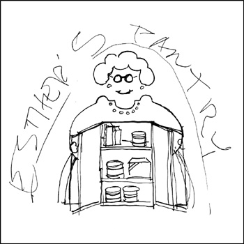
In 1995 I sketched out a rough concept for a pro bono logo for the Portland nonprofit organization Esther's Pantry. Esther’s Pantry was founded in 1985 to provide individuals living with AIDS access to food and personal care items they themselves might not be able to afford. The organization was named in memory of Chester "Esther" Brinker, one of the first people in Portland to die of complications from AIDS.

Still, my take on "Esther" was meant to cause people to smile through the suffering and pain of the continuing AIDS crisis. I saw Esther as a bit of a "flasher," opening her jacket to reveal what was on the shelves of the "pantry." The female character in the design is actually a fairly good graphic representation of my late great-grandmother Osie Saltmarsh Cantrall Norris - a Southern Oregon pioneer and one of the most incredible people in my life.

In March 2000, the pantry transferred its operation to MCC Portland (I designed their logo in 1995 as well) and I was asked to redesign the logo as a grocery bag image that I never liked much. In fact, I've never even included that design in my portfolio. It was determined that my "Esther" - used in a limited fashion for a while - was a bit glib and possibly controversial.

I was very pleased when my Esther's Pantry logo was honored in the 1995 PRINT Regional Design Annual. I still smile each time I come across the image - and I'm sure that great-grandma gets a kick out of it, too.

It's great that Esther's Pantry continues on - with, it appears, an even newer logo. Each month 150 to 200 clients are allowed to select their groceries and personal care items from well-stocked shelves, rather than being handed a pre-packed box of food.

(This entry originally appeared on bLog-oMotives on December 30, 2006.)

© 2008 Jeff Fisher LogoMotives

Identity Re-Design: VanderVeer Center

Dr. Elizabeth VanderVeer’s clinic, offering nonsurgical cosmetic procedures, was having an identity crisis. In the period of just over a year there had been two name changes (one logo is shown above) and a major internal business reorganization.

It was decided to rebrand the company with the Doctor’s name. Initially I was asked to maintain Papyrus as the font for the redesign. By showing the client multiple images of the font in use by local businesses I was able to encourage the use of another typeface.

Originally the client proposed that the identity have an Asian influence, with bamboo as a design element. As the project progressed further, it seemed more appropriate to create an image that worked well with the rich Tuscan colors the walls of the clinic had been painted. The font Mousse Script lent itself well to use in the identity, especially with the expressive “V” letterforms.

Once the new logo (at right) was finalized the rebranding took an unusual turn. Before a stationery package, or any collateral materials, could be designed the immediate creation of a two-page magazine spread was required to meet an impending deadline for the premiere issue of a new publication.

The previous ads (at left) ran over a period of the previous six months and demonstrated the split personality of the business at the time.

The fact that Dr. VanderVeer was an artist led to the proposing of “The Art & Science of Image Enhancement” as a tagline. With the photo images of Loma Smith, the colors of painted walls in the clinic and the new identity, the ad effectively introduced the VanderVeer rebranding. The ad became the inspiration for all other marketing and advertising pieces.

The rebranding of the VanderVeer Center is one of 50 case studies, from designers and firms around the world, featured in my latest book, Identity Crisis!: 50 Redesigns That Transformed Stale Identities Into Successful Brands. The volume was released by HOW Books in late 2007. Read more about the book on the Identity Crisis! blog.

The initial two-page VanderVeer Center ad (above) was honored with a 2007 Summit Creative Award. A one-page version of the ad appears in The Big Book of Layouts. The VanderVeer Center logo is featured in The Big Book of Logos 5 and Design DNA - Logos: 300+ International Logos Deconstructed. The rebranding case study is also posted on the membership site The Designers Inner Circle.

© 2008 Jeff Fisher LogoMotives.

Education Logos

(Clockwise from upper left)

George Fox University 2002-03
Client: George Fox University
Location: Newberg, OR USA

The logo for a George Fox University admissions program appears in the Spanish book Logos from North to South America (Spain).

Reed College Fall Thesis 2005
Client: Reed College
Location: Portland, OR USA

This image was created to recognize the 2005 Fall Thesis students at Reed College. The logo appears in The Big Book of Logos 5.

PACRAO
Client: Pacific Association of Collegiate Registrars and Admissions Officers

PACRAO is a non-profit association representing more than 350 regionally accredited 2-year, 4-year, and graduate schools with an individual membership of 1,500 professional admissions officers and registrars. The identity is featured in The New Big Book of Logos.

Sunriver Preparatory School
Client: Sunriver Preparatory School
Location: Bend, OR USA

This logo redesign evolved from a "grocery list" of possible items to be included in the image, including the nearby geographic landmarks of the Three Sisters Mountains, the ski slopes of Mt. Bachelor, Broken Top mountain and the Deschutes River. The school's wolf mascot was to be incorporated in the design if possible. The logo received an American Corporate Identity 16 Award and, as a result, was published in the book American Corporate Identity 2001 (HBI, USA, 2000). It is also included in The New Big Book of Logos (HBI, USA, 2000) and Logo World (P.I.E. Books, Japan, 2001).

Read more about the school identity redesign effort in this entry.

All logo designs © 2015 Jeff Fisher LogoMotives. All rights reserved.

Excavated Design Artifact #6

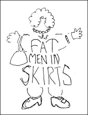
In his Right Brain Reader article, Away from the sketch pad; away from the struggle, Philip Bailey mentioned the logo I had designed for the theatrical production Fat Men in Skirts. Having done the logo about a decade ago, I had not thought about the image in some time - and then the other day I came across my original sketch for the identity on a scrap of laser paper that I had filed away.

I've been designing logos for triangle productions! theatre presentations for over 16 years. Producer/director Don Horn has been a dream client. He'll throw some odd play or musical name my way and leave me alone to create the identity for the show. He seldom even requests any changes in the designs. In this case, the production was to be playwright Nicky Silver's show Fat Men in Skirts.

I almost immediately had an image for the logo in my mind - kind of a cross between a middle-aged thick manly man and someone's pleasantly plump grandmother - with curly black chest hair. I quickly sketched out a rough design and then proceeded to take the image to the computer. In my digital design I wanted to maintain some of the qualities of the rough drawing - without giving the "fat man" too much detail.

The show was yet another successful local theatre production. My logo design had some success as well. It was recognized by the PRINT's Regional Design Annual at the time and was published in the Japanese design book New Logo & Trademark Design - which was recently republished in paperback as Logo and Trademark Collection.

(This entry appeared on bLog-oMotives on September 26, 2006.)

© 2008 Jeff Fisher LogoMotives

Identity Re-Design: Just Out

Just Out, the statewide monthly newsmagazine for Oregon's lesbian, gay, bisexual and transgender communities, was approaching 22 years in operation and its identity was showing some age. The heavy, bulky type treatment of the name (below left) was definitely hinting at the 1980's and 1990's.

Publisher and Managing Editor Marty Davis wasn't seeking an entirely new "look" with a redesigned logo, but rather a refined - possibly redefined - treatment of the existing identity. The hope was to maintain the readers' immediate recognition developed at newsstands over the years, while making the paper's flag fresh and a bit more flexible in cover design applications.

The use of the font Gill Sans gave the identity a fresh, contemporary and slimmed-down look (above right) that has worked very well for the publication.

The award-winning Just Out logo appears in the books American Corporate Identity 2008 and The Big Book of Logos 5

(Note: My new book, Identity Crisis!: 50 Redesigns That Transformed Stale Identities Into Successful Brands, contains case studies from 35 designers and firms located around the world. Learn more about the book on the Identity Crisis! blog.)

© 2008 Jeff Fisher LogoMotives

Excavated Design Artifact #5

Recently, while cleaning out a box of old unfiled business papers, I came across a doodle that was to become one of my most successful logo designs. As it is the identity for a law firm, it is somewhat appropriate that the sketch is on a piece of a yellow legal pad. Creating a logo for a law firm can bring about many challenges. In addition to the partners in the business name, there are usually at least a few other lawyers who desire to claim some ownership in regards to selecting a final design. In such situations a designer needs to tactfully perform the "design by committee" dance. It can also be tough to convince the members of a legal firm to stray from the traditional conservative designs often used to promote such a company. It is necessary to convey that creating an original image positions the firm as unique in the market.

The identity process for the Portland law firm Samuels Yoelin Kantor Seymour & Spinrad went through numerous somewhat complicated iterations before one of the main partners in the firm suggested returning to an early, very simple concept. That design was a graphic interpretation of two thick law books creating the “S” letterform – representing the name Samuels, designated as the one constant in any future name changes. In a moment totally unrelated to meeting with the attorneys, while on the phone with another client, I drew out my initial thoughts with a felt tip pen. In fine-tuning the design I made the "books" come across as much more like the heavy legal volumes I'd seen in the firm's office bookcases. With some prodding by the one partner advocating the image, the icon was adopted by the firm and it has served them well over the past decade.

The design brought a great deal of attention to my identity creation efforts. The logo appeared in a PRINT Regional Design Annual, won a LOGO 2000 award, and received a Bronze in the Summit Creative Awards. The design was also published in the books International Logos & Trademarks 4, Letterhead and Logo Design 5, The Big Book of Logos, Global Corporate Identity, The Best of Letterhead and Logo Design, and the Japanese volume New Logo & Trademark Design (which has been re-released in paperback as Logo and Trademark Collection).

(This entry originally appeared on bLog-oMotives on September 19, 2006.)

© 2008 Jeff Fisher LogoMotives

Toot! Toot!*:
Jeff Fisher interview featured on FreelanceSwitch

An interview with designer and author Jeff Fisher, the Engineer of Creative Identity for the Portland firm Jeff Fisher LogoMotives, is currently featured on the web presence FreelanceSwitch. In the piece, "Veteran Designer Embraces Identity Crisis and Casual Fridays," written by Kristen Fischer, the designer discusses his 30-year career and recently released book Identity Crisis!: 50 Redesigns That Transformed Stale Identities into Successful Brands.

FreelanceSwitch is an online resource for all independent creatives, offering advice, articles, podcasts, a job board, and a community forum for designers, writers, illustrators, photographers, web developers and others.

Kristen Fischer, an independent copywriter and editor, is also the author of the book Creatively Self-Employed, in which designer Fisher was featured.

Jeff Fisher has received nearly 575 regional, national and international graphic design awards for his logo and corporate identity efforts. His work is featured in nearly 100 books on the design of logos, the business of graphic design, and small business marketing.

Fisher is a member of the HOW Magazine Editorial Advisory Board, the HOW Design Conference Advisory Council and the UCDA Designer Magazine Editorial Advisory Board. His first book, The Savvy Designer’s Guide to Success, was released in 2004 by HOW Books, also the publisher of Identity Crisis!.

(* If I don’t "toot!" my own horn, no one else will.)

© 2007 Jeff Fisher LogoMotives