[Over the 30+ years I've worked professionally as a designer, interesting side stories have come up about my identity designs. This is one of an ongoing series of "Logodotes" - anecdotes about my logo designs.]
To be honest, a designer doesn't often find themselves in the position to create a logo with the subject matter of "2 Boys in a Bed on a Cold Winters' Night." I've always been lucky enough to have the opportunity to balance my corporate work with design efforts that are a bit more off-the-wall. "2 Boys in Bed..." was a play being presented by local avant garde theatre company triangle productions!
During almost two decades of designing work for the theatre client, producer Don Horn has always provided the scripts to the shows for which I was creating graphics. In this case the title of the play described the show fairly well. In a 1987 New York winter setting, at the height of the AIDS crisis, two gay men met in a bar, go back to the threadbare apartment of one and, after having sex, end up having a lengthy discussion.
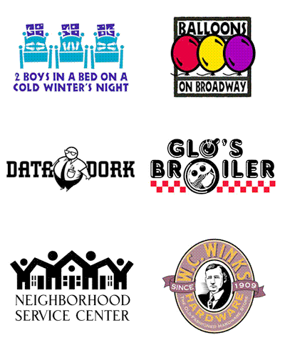
With the design, I immediately wanted to create an eye-catching and simple graphic that would subtly convey the activities of the characters and the passage of time during the night. Within the windows of three graphic panels (above) the moon and star elements seemed to move, hinting at the time passing. My warped sense of humor had a great deal of fun positioning the feet in the bed to reflect a variety of possible sex acts taking place as the night progressed.
The graphic image, without accompanying type spelling out the name of the play, was printed on the front of a white T-shirt promoting, and sold at, the show. The logo, with type (below) was reproduced on the back of the shirt. Ticket and T-shirt shirt sales were very successful.
I have shelves of T-shirts. I'll often grab one and put it on without even paying attention to the printed graphics. Such was the case on the day I wore my "2 Boys in a Bed" tee to a local grocery store. I was still oblivious when I became aware of a woman walking directly my way.
As she got closer she said, "I love your T-shirt design - where can I get..."
It was then I saw a look of horror come over her face as she zeroed in on the positions of the feet in the beds of the graphic. With her face now bright red, she added, "Never mind," and walked away as fast as possible.
If the hope of a graphic designer is for their work to produce action, or a reaction, the "2 Boys in a Bed..." logo was certainly a success.
The identity has been featured in the books New Logo & Trademark Design (Japan), The New Big Book of Logos, Letterhead and Logo Design 7, Graphically Speaking, LogoLounge - Volume 1, and New Logo: One (Singapore). On my Logopond showcase the comments and critiques of the design even drifted to the question of whether two men could have sex in one of the positions shown. It also has the distinction of being included in the recent Graphic Design Blog post "40 Weird and Playful logos – A Double treat!"
© 2009 Jeff Fisher LogoMotives


